Settings affecting the current user only
The following Settings are saved for each username. So, if you have several users in your company, each can set his/her own preferences.
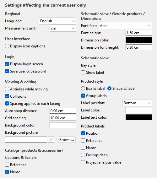
Default values shown above
Regional
Language
The language of the application.
- Supported values:
- Deutsch: German
- English: English
- Español: Spanish
- Français: French
- Italiano: Italian
- Português (Brasil): Portuguese (Brazil)
- Русский: Russian
- Default value: the language you used to request your free trial on our website, English otherwise.
Measurement unit
The measurement unit used in PlanogramBuilder, such as for room elements, shelving and product dimensions.
- Supported values:
mm
millimeters
centimeters
inch
decimal inches
meters
- Default value: cm
Note: changing the measurement unit lets you enter and display the dimensions of products or shelving in your preferred unit. It does not change their actual size.
User interface
Display icon captions
Toggles the display of text captions under the buttons on toolbars.
Note: If you have a low-resolution screen or if you have set a high display scale in Windows, displaying the captions may prevent all the buttons fitting on your screen. In such case, some toolbars become scrollable to give access to the hidden buttons, but we rather advise turning off captions for ideal comfort.
Login
Video tutorial on this topic: 2: PlanogramBuilder basic settings
Display login screen
Toggles the visibility of the application login screen.
- Supported values:
- Checkmarked: this forces PlanogramBuilder to always show the login screen.
- Not checkmarked: the login screen is bypassed (Save user & password must also be checkmarked).
- Default value: Not checkmarked
Save user & password
Toggles remembering the username and password for subsequent logins.
- Supported values:
- Checkmarked: the application remembers the last entered username and password, so you don’t have to type them again.
- Not checkmarked: you must always enter your username and password when opening PlanogramBuilder.
- Default value: Checkmarked
Viewing & editing
Antialias while moving
Toggles antialiasing (edge smoothing) while interacting with the planogram visualization.
- Supported values:
- Checkmarked: the on-screen planogram visualization is always antialiased (smoothed) even while navigating the view or moving items in your planogram.
- Not checkmarked: the on-screen planogram visualization is antialiased only when static. The image quality is a little harsher while moving objects or the view. Choose this setting if you experience slow response while moving the view or objects.
- Default value: Not checkmarked
Collisions (Settings)
Controls collision detection for all items and elements in PlanogramBuilder. Collision detection mimics the real world by preventing any overlap between objects. Items can also be pushed by other items when moving them.
- Supported values:
- Checkmarked: collision detection is activated, and the items cannot overlap.
- If the desired item position overlaps another item, the item you are positioning pushes the other item(s) to make space if there is, or it can be blocked by the other item if there is no room to push it further.
- If the desired item position overlaps a bay component, the item you are positioning collides and is blocked by the bay component.
- Not checkmarked: collision detection is deactivated. All items can be placed freely and overlap.
- Default value: Checkmarked
Advice: As an alternative to de-activating collision detection in the settings, you can disable collisions temporarily by holding down the C key on your keyboard while moving or dragging items on shelves. This is useful to prevent pushing items around while moving them on the shelves.
Spacing applies to each facing
Toggles the effect of spacing when using spacing commands on same products within blocks.
- Affected commands:
- Supported values:
- Checkmarked: All the products are redistributed in space no matter if they are part of a block of the same products. All gaps between products within product blocks are also adjusted to match the desired distribution. Use this setting if you want to obtain an even spacing between products, including between multiple facings of products that are part of the same block.
- Not checkmarked: The groups of the same products are treated as single entities. The gaps between individual products within blocks are however maintained as in the original block. Choose this setting if you want to obtain an even spacing between product blocks, while being able to adjust separately the spacing between products inside blocks.
- Default value: Checkmarked
- Examples: Both values are illustrated here: Align and space (products and accessories).
Background color
Sets the background color the visualization area
The color can be specified as follows:
Color text field:
- Supported values: HTML color codes (with or without the # prefix, not case-sensitive). Complete reference of theses HTML color codes can be found for example at:
- Default value: #FFFFFF (white)
- Example: 000000 (black)
Color sample:
- Click on the color sample next to Color to display the color palette.
- Select the desired color.
- Click OK.
Notes:
- When you change this setting, the latest color is saved in your account and re-used for new projects.
- The current background color is also used in Single pictures.
- The current background color is NOT used in Reports, which have their own background color setting.
Background picture
Defines a background image for your planograms.
- Supported values: file path of image file in supported format (jpg, png, bmp, gif, tif)
- Default value: empty
- Example: C:\Desktop\my_shop_wall.jpg
Instructions:
- Click on Browse.
- Select the desired image file on your PC.
- Click on Open.
- Wait for the image to upload.
To remove the background image, click on the small red cross button.
Notes:
- This setting is saved per user and applies to all projects.
- The background image is also used in Single pictures.
- The background image is NOT used in Reports.
Warning: If you delete the image from your computer, or if you open PlanogramBuilder from a different computer, the background image won’t be displayed.
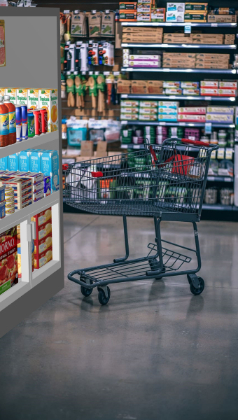
Advice: If you have taken a photograph of the store area where your project will be implemented, you can use a photo as the background and see your project in situation. Example below:
Text of item tooltips
When the tool named Edit products and accessories is active, a tooltip is displayed when hovering your mouse over any product or accessory in the visualization area.
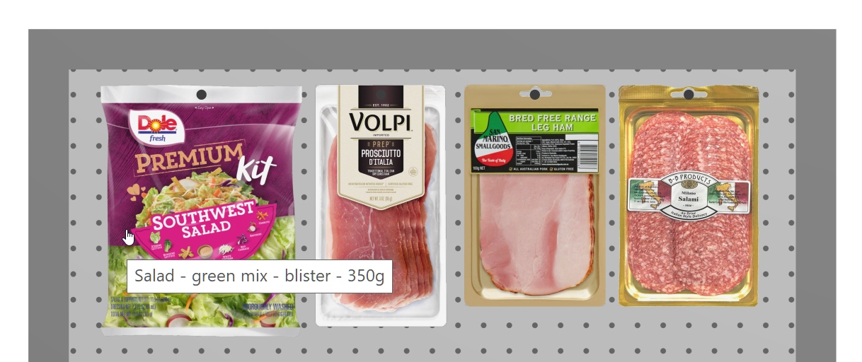
Example of an item tooltip showing the item name.
- Supported values: any item property as well as several computed values. cf. Columns (Project item list) for details on each available property, since the same choices are described there.
- Default value: Name
- Example: Reference
Instructions:
- Next to Text of item tooltips, click on the current item information (for example Name) .
- A dialog window opens, showing the list of available content.
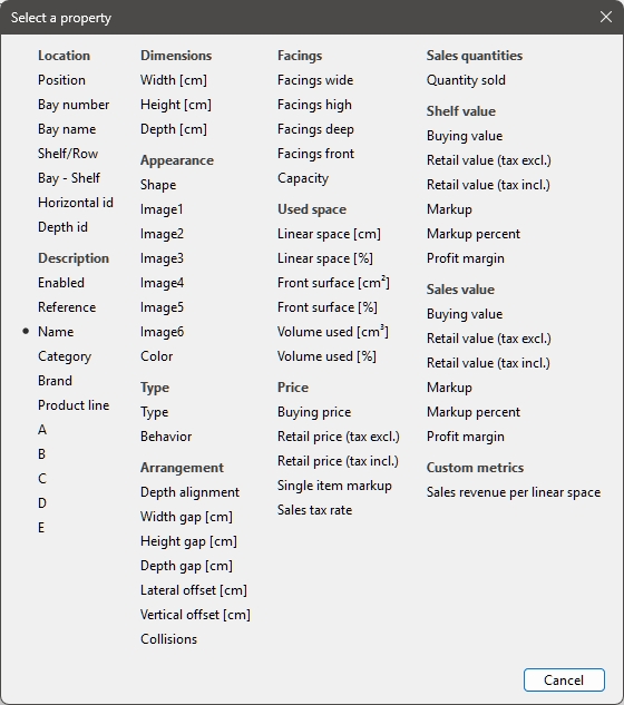
- Select a content to display on the tooltips, for example> Reference.
- The dialog window closes.
- The new tooltip information is now set.
Catalogs (products & accessories)
Captions & Search
This sets the property values displayed as text descriptions below each thumbnail in the catalogs of items Catalog of products, Catalog of accessories). The selected properties can also be used to search items by text in the catalogs based on their corresponding values (cf. Search by text (Catalog of products)).
- Supported values:
- Reference
- Name (cf. Name (Item properties))
- Item custom properties [1 - 20]. (cf. Item custom properties (Settings) to define these properties)
- Default value: Name
- Example:
- Reference
- Weight
Note: This setting doesn’t apply to Template catalog, Personal (New room elements), Personal (Material catalog) and Personal (New bay components), which always shows the item names.
Instructions:
- Click on Choose properties.
- The following dialog is displayed.
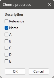
- Put a checkmark next to the properties to display in the catalogs.
- Click OK.