Item properties
The right side of the screen shows all the properties of the selected item(s). This is where you can review and edit item properties, such as the name, dimensions, shape, image(s), etc.
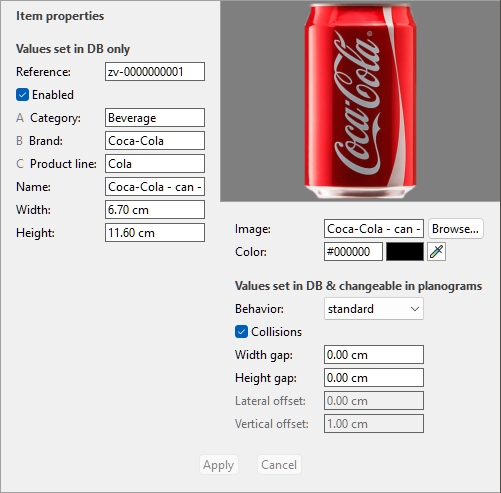
The available properties vary depending on the type of item(s) selected.
The only property for which a value is compulsory is Reference.
We however recommended also always assigning values for the following basic properties:
- Name (Item properties)
- Width (Item properties)
- Height (Item properties)
- B [B: Classification - level 2]
- C [C: Classification - level 3]
- Image
- Behavior
Other properties can often be left empty, in which case default values will be used.
Note: if you have selected multiple items, the property values that are common to all selected items are displayed. A blank value is displayed for property values which vary across the selected items.
The property pane is divided into two groups of properties, each described below.
Values set in DB only
The upper part of this pane contains the item properties which values are defined in the database and cannot be modified per item in a planogram project.
They are typically attributes inherent to the item itself, which keep the same values in any planogram, such as its dimensions, name or color.
Each property is described below.
Type (Item properties)
This property defines the type of item in the database.
- Supported values:
Product
This type of items corresponds to the items you sell. It also includes tester products placed in front of the sellable packaged version (consult tester in Product behaviors).
Accessory
This type is used for all items displayed on shelves to enhance product presentation: shelf strips, labels, headers, posters, non-sellable products displayed without packaging, etc.
- Default values:
- In spreadsheets: empty cell (= Product)
- In GUI: your choice of Type of items in Content choice
The type of each item can be displayed in Project item list (therefore also in Reports).
Note: In spreadsheets, when batch importing items, you can still use our previous notation system for these values:
- 0 for Product
- 1 for Accessory
Reference
The compulsory unique identifier of the item.
This property is used to identify each item in the database. Each item must therefore have a distinct value which cannot be used for any other item.
Also, the value assigned at creation cannot be changed in the database afterwards, contrary to all other properties.
We advise using the EAN, UPC, SKU code or any other permanent and unique product reference.
- Supported values: [0-9][A-Z][a-z][the space character]$&@=.,;-_!^~)(][}{
- Unsupported values: all characters not listed above (e.g., non-Latin characters). Invalid characters are replaced by an underscore [_] when batch importing.
- Default value: none
- Example: 045631548b
Notes:
- The number symbol [#] is not allowed in the database task field but can be used with a special meaning with Import list + images and with Import list.
Enabled
The state of activation of the item.
- Supported values:
- Yes (checkmarked in the GUI): the item is available in the catalogs to place in planograms (Catalog of products, Catalog of accessories).
- No (not checkmarked in the GUI): the item exists in the database but is not available in the catalogs. Disabling items is useful to prevent other users in your company from placing these items in planograms, such as products that are no longer sold but you may want to reactivate later.
- Default value: Yes (checkmarked in the GUI)
Tip: you can highlight disabled items in red in the current planogram project. Consult Highlight by Enabled.
Note: In spreadsheets, when batch importing or exporting items, you can still use our previous notation system for these values: 1 for Yes, 0 for No.
A [A: Classification - level 1]
The item classification value at the first level. (Before using this property, consult Item classification properties to define its name.)
Assign this optional value to organize your item.
- Supported values: text, including Unicode characters for non-Latin text values
- Default value: empty (= none)
- Example: Drinks
Note: items with empty values are shown in the catalog as: undefined.
Note: this value is not case sensitive, so items with variations are grouped in the database list and in the item catalogs. E.g., Toys and TOYS are grouped as the same value.
B [B: Classification - level 2]
The item classification value at the second level classification property. (Before using this property, consult Item classification properties to define its name.)
Assign this optional value to organize your item.
- Supported values: text, including Unicode characters for non-Latin text values
- Default value: empty
- Example: Coca-Cola
Note: items with empty values are shown in the catalog as: undefined.
Note: this value is not case sensitive, so items with variations are grouped in the database list and in the item catalogs. E.g., Toys and TOYS are grouped as the same value.
C [C: Classification - level 3]
The item classification value at the third level classification property. (Before using this property, consult Item classification properties to define its name.)
Assign this optional value to organize your item.
- Supported values: text, including Unicode characters for non-Latin text values
- Default value: empty (= none)
- Example: Cherry
Note: items with empty values are shown in the catalog as: undefined.
Note: this value is not case sensitive, so items with variations are grouped in the database list and in the item catalogs. E.g., Toys and TOYS are grouped as the same value.
Name (Item properties)
The name of the item.
Assigning a value for this property is optional but very recommended to help you identify the item in the catalog and in your planograms.
Enter the actual item name, typically as printed on the item packaging.
- Supported values: text, including Unicode characters for non-Latin text values
- Default value: empty (= none)
- Example: Coca-Cola Zero 500 ml
Note: For materials, if the value is empty, an initial value is automatically assigned using the image file name (without the extension) as basis. You can also assign your own value if you prefer.
Item custom properties [1 – 12]
The value of the item for the selected custom property.
A maximum of 12 user defined custom properties can optionally be used to assign values to each item in your database. Only the custom properties which have been defined appear in the database item properties. Consult Item custom properties (Settings) to define your custom properties.
- Supported values: text, including Unicode characters for non-Latin text values
- Default value: empty (= none)
- Example: 5 kg
Width (Item properties)
The physical width of the item in the current measurement unit.
- Supported values: positive numeric value [0-9 and decimal point]
- Default value: empty (= 10 cm, 100 mm, 0.1 m, 5 inches; according to Measurement unit)
- Example: 6.5
Tip: You don't need to type the actual measurement unit (e.g., cm), only the value.
Height (Item properties)
The physical height of the item in the current measurement unit.
- Supported values: positive numeric value [0-9 and decimal point]
- Default value: empty (= 10 cm, 100 mm, 0.1 m, 5 inches; according to Measurement unit)
- Example: 10.2
Tip: You don't need to type the actual measurement unit (e.g., cm), only the value.
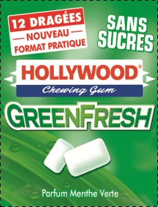
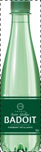
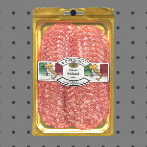
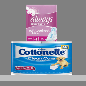
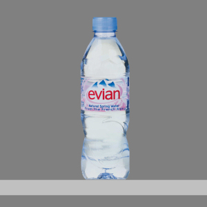
Image
One image applied to the item to achieve a more realistic look.
- Supported values: file name and extension in supported format (jpg, png, bmp, gif, tif)
- Default value: empty (= none)
- Example: Body wash - avocado - flacon - 500g.png
Instructions:
- Click on Browse.
- Select the desired image file on your PC.
- Wait for the image to upload to the database. Progress is shown on the status bar as a percentage value.
- Click on Create (database item)to see the result (or click on Apply (database item) if you are updating the item).
- Repeat these steps for all available image fields.
To upload images for multiple items in a single operation, consult Import list + images.
Note: Images are not compulsory. If you don't apply a picture, the product will have a uniform color (which you can define with Color (Item properties)), and its name will be printed on the product front if it uses the shape named box.
Image transparency
- Images with a transparent background let you obtain a realistic look by showing only the object, and hiding the background area of the image. This is especially useful for unpackaged productsImage file formats supporting transparency:
- png and tif in 32-bit color: 256 levels of transparency (alpha channel).
- png and gif in 8-bit color: 1 transparent color.
Maximum image file size: 5 MB. Bigger files won’t be uploaded.
Maximum pixel count: images are automatically downsized by PlanogramBuilder if larger than 786'432 pixels (=1024 x 768 or 500 x 1573 for example). Uploading larger images does therefore not provide better quality. Ideally, use images which pixel resolution is just large enough to distinguish the desired details such as the text on the product or packaging.
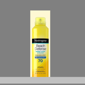
Choosing the right product view
- take a picture of the product’s most representative face (usually the front face).
Taking the pictures
- Don't turn on your camera flash as it creates bright hotspots on the photo.
- Take the picture straight on, not from an angle.
- Ideally, don't use a wide-angle lens (i.e.. smartphone) as it distorts objects.
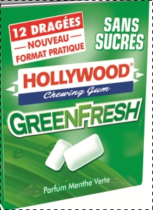
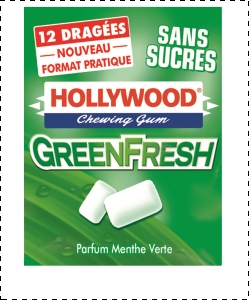
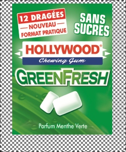
Cropping your images
- Auto-crop: if your images have a transparent background as explained above, PlanogramBuilder performs an automatic crop to remove the unwanted area surrounding the product.
- Manual crop: images that don't have a transparent background should be cropped manually to the outer limits of your product (i.e., the image must be cropped so that the outline of the product touches the 4 outer edges of the image). Consult the image examples below.
Example pictures
Please look at the examples of good and bad pictures below. The dashed lines represent the edges of each image:
Bad picture: it is skewed because it was taken from an angle.
Bad picture: the unwanted extra space in image around product will not be automatically cropped because this image has no transparency.
Good picture: the unwanted extra space in the image around the product will be automatically cropped because it is transparent.
Good pictures: the product is seen straight from the front and the image is cropped at the outer bounds of the product.
Good picture: the product is seen straight from the front and the image is cropped at the outer bounds of the product.
Color (Item properties)
This property lets you specify a uniform color for each item in the database.
The color has the following effect on items:
- The specified color is applied to the whole item if no image is specified for the item.
- The color is also applied in Schematic view when Product style is set to Box & label.
In all cases, the color can be specified as follows:
- Supported values: HTML color codes (with or without the # prefix, not case-sensitive). Complete reference of theses HTML color codes can be found for example at:
- Default value: empty (= #FFFFFF) (white)
- Example: #FF8000 (orange)
When creating or editing an item directly in the Database task, the color can also be picked as follows:
- Color swatch:
- Click on the color swatch next to Color to display the color palette
- Select the desired color.
- Click OK.
- Color Picker:
- Click on the color picker icon next to Color to activate the tool.
- Pick any color from the 3D item in the preview area.
- While pressing your mouse button over any area with the color picker, the color swatch is updated with the selected color.
- Release your mouse button to apply the color.
Note: the color picker tool remains active until you click on another tool such as Zoom.
Values set in DB & changeable in planograms
The lower part of this pane contains the item properties which values are defined in the database, but that can be overridden per item in planogram projects. This provides flexibility for property values that are not always the same depending on the situation.
Typically, you will set these property values in the database to match the most common values (if any) for each item or leave empty values otherwise.
For example, you will set the behavior of a product to pegged in the database if it's usually placed on hooks, but you can override this behavior for any product in a planogram by changing it to standard in case you need to place the product on a shelf. (Consult Item Info to learn how to override these properties per facing.)
Each property is described below.
Behavior
This property defines how each item is placed onto shelves and fixtures.
PlanogramBuilder provides various behaviors to match typical placements of products and accessories. Choose the behavior which corresponds to the most often-used placement mode for the selected item.
- Supported values: consult lists below
- Default values:
- for products:
- In spreadsheets: empty cell (= standard)
- In GUI: standard
- for accessories:
- In spreadsheets: empty cell (= panel)
- In GUI: panel
- Example: pegged
The following values are available:
Product behaviors
Four types of products can be used in PlanogramBuilder:
|
Behavior |
Description |
Example |
pegged |
A pegged product. It hangs on pegs. Use this behavior for any product which is most often placed on hooks (e.g., blister packs). |
|
stackable |
This is the same as standard products except it can be stacked onto different products which also have the stackable behavior. Use this behavior for products which must often be stacked on or below different products (e.g., large dog food bags with variations that must share the same shelf space to gain room). Note: a stacked product is centered laterally on the product below, so it is best suited for stacking different products of the same width. Warning: do not use this behavior if you want to create vertical piles of the same product. In this case consult Facings high. |
|
standard(default value) |
A standard product. It sits on shelves. Use this behavior for any product which is most often placed on shelves (e.g., bottles of soda). |
|
tester |
A tester product. It sits on shelves and is placed at the front edge of the shelf. You can place standard products behind it. Use this for out-of-box products placed in front the packaged version of the same product (e.g., perfume testers) |
|
Tip: For products that are sometimes placed differently depending on the available shelving, you can later override the database behavior per item in any planogram (consult Item Info).
Note: Even if you choose a language other than English for the user interface, the names of the behaviors remain as listed above.
Accessory Behaviors
Several types of accessories can be created in PlanogramBuilder:
|
Behavior |
Description |
Example |
bay header |
An accessory which snaps to the top of any back panel. Note: if the bay has no back panel, you cannot place a header. In this case we suggest creating a small back panel as a crossbar to support your desired header. Use this to place header panels above your back panels. |
|
panel(default value) |
An accessory which snaps onto the back panels of any shelving. Note: if the bay has no back panel, the panel can be positioned between the lowest and highest shelves. Use this to create posters, back cards or any other hanging POS. |
|
Shelf strip |
An accessory which snaps onto the front edge of any shelf. It is horizontally centered and aligned to the top of the shelf. Use this to create single shelf strips. |
|
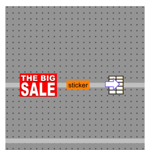
sticker |
An accessory which snaps to the front of a shelf or shelf strip at any lateral position. Use this to create cards, typically used to show information or specials. |
|
tag |
A box which can be placed on the front edge of a shelf as a label for the actual product name, pricing or other text (no image). Tags have dedicated parameters: Consult the above links for each parameter. |
|
shape defined |
This is a special behavior to use only if you have been instructed to. |
|
Note: Even if you choose a language other than English for the user interface, the names of the behaviors remain as listed above.
Collisions (Item properties)
This property enables or disables collision detection for the item.
- Supported values:
- Yes (checkmarked in the GUI): the item will collide with other items.
- No (not checkmarked in the GUI): the item will be able to overlap other items in the planogram. Typically, it can be necessary to disable collisions for items that have overhanging parts or are slanted sideways. This will allow placing them adjacent.
- Default value: Yes (= Checkmarked in the GUI)
Note: The value of this property has no effect if Collisions (Settings) is not checkmarked.
Tip: you can later override this database value per item in any planogram (consult Item Info).
Note: In spreadsheets, when batch importing or exporting items, you can still use our previous notation system for these values: 1 for Yes, 0 for No.
Width gap
Only applicable to products.
The horizontal gap between the products when multiple Facings wide are used.
- Supported values: positive/negative numeric value [+-0-9 and decimal point] (based on Measurement unit)
- Default value: empty (= 0)
- Example: 0.3
Note: For a product pegged on peg board panels, the value entered corresponds to the minimal gap: the product will be placed on the nearest hook guaranteeing this minimal gap.
Tip: you can later override this database value per item in any planogram (consult Item Info).
Height gap
Only applicable to products.
The vertical gap between the products when multiple Facings high are used.
- Supported values: positive/negative numeric value [+-0-9 and decimal point] (based on Measurement unit)
- Default value: empty (= 0)
- Example: 2
Note: For products pegged on peg board or slat panel panels, the value entered corresponds to the minimal gap: the product will be placed on the nearest hook guaranteeing this minimal gap.
Tip: This parameter is also very convenient if you want to represent products nested in a pile. In this case, enter a negative value corresponding to the amount of space the product should be nested inside the one below. E.g., enter -3 for a bowl which is nested 3 units inside the bowl below itself.
Tip: you can later override this database value per item in any planogram (consult Item Info).
Lateral offset (Item properties)
Applicable only to pegged products.
The left or right offset position of pegged products. This is convenient when the product hanging tab is not centered on the product.
- Supported values: positive/negative numeric value [+-0-9 and decimal point] (based on Measurement unit)
- Default value: empty (= 0)
- Example: -1.2
Usage:
- value of 0 = the product is centered on the peg hole
- positive values = offset the product right
- negative values = offset the product left
Note: The offset can be previewed in database editor if View peg hooks is checkmarked.
Tip: you can later override this database value per item in any planogram (consult Item Info).
Vertical offset
Applicable only to pegged products.
The vertical offset position of pegged products. This is convenient to adjust the exact product hanging hole vertical location.
- Supported values: positive/negative numeric value [+-0-9 and decimal point] (based on Measurement unit)
- Default value: empty cell (= -1 cm, -10 mm, 0.1 m, -0.39 inches; according to Measurement unit)
- Example: -1.6
Usage:
- empty value = the peg hole is offset below the top edge of the product by the default value.
- value of 0 = the product top edge is aligned to the peg hole on the back panel
- positive values = offset the product up
- negative values = offset the product down
Note: The offset can be previewed in database editor if View peg hooks is checkmarked.
Tip: you can later override this database value per item in any planogram (consult Item Info).
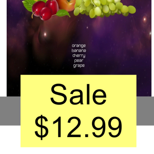
Caption
Applicable only to accessories with Behavior: tag
The text to display on the selected tag.
- Supported values:
- text strings, including Unicode characters for non-Latin text values (e.g., On Sale)
- [br]: displays a line break
- [position]: displays a number reflecting the value of Position for the product nearest to the tag. The number helps identifying the product position and has the same value as Position in Project item list.
- [reference]: displays the value of Reference for the product nearest to the tag.
- [name]: displays the value of Name (Item properties) for the product nearest to the tag.
- [Item custom properties [1 – 12]]: displays the value of the corresponding custom property for the nearest product. Replace Item custom properties [1 – 12] by the actual property name you defined in the settings. E.g., [Weight]
- any combination of the above values
- Default value: empty (= none)
- Example: On Sale [br] 20% OFF [br] [name]
Note: Make sure to type the square brackets when applicable.
Tip: you can later override this database value per item in any planogram (consult Item Info).
Text height
Applicable only to accessories with Behavior: tag
The caption height of the selected tag.
- Supported values: positive numeric value [0-9 and decimal point] (according to Measurement unit)
- Default value: empty (= 0) (automatic text height)
- Example: 0.3
With an empty value or a value of 0, the text height is calculated automatically based on the item height.
Tip: you can later override this database value per item in any planogram (consult Item Info).
Text color (Item properties)
Applicable only to accessories with Behavior: tag
The color of text captions for the selected tag.
- Supported values: HTML color codes (with or without the # prefix, not case-sensitive). Complete reference of theses HTML color codes can be found for example at:
- Default value: empty (= 000000) (black)
- Example: #0000FF (blue).
When creating or editing an item directly in the Database task, the color can also be picked as follows:
- Color swatch:
- Click on the color swatch next to Text color (Item properties) to display the color palette
- Select the desired color.
- Click OK.
- Color picker:
- Click on the color picker icon at the right of the color swatch to activate the tool.
- Pick any color from the 3D item in the preview area. While pressing your mouse button over any area with the color picker, the color swatch is updated with the selected color.
- Release your mouse button to apply the color.
Note: the color picker tool remains active until you click on another tool such as Zoom.
Tip: you can later override this database value per item in any planogram (consult Item Info).
Item commands
The following commands are accessible as buttons below the item properties.
They are used to apply or cancel changes made to the item properties.
Create (database item)
This command finalizes the creation of the item with all the values entered and the choices made under Item properties.
Consult New item for complete instructions.
Apply (database item)
This command updates the selected item(s) with all the values entered and the choices made under Item properties.
Tip: The process described below is for modifying items directly in the user interface. Another feature, Import list + images, lets you to update batches of items and is much quicker when you need to modify several items with different values in one shot. Also note that mixed usage of editing items in the user interface and batch importing is not a good idea. It can lead to discrepancies between your database content and your local file content, making it complicated to synchronize item updates.
Instructions:
- On the left of Database item list, expand Content choice if it’s collapsed.
- Under Type of items, click on a radio button to choose products or accessories.
- Select the item(s) you want to modify in the list. Use Item filters to help.
- Under Item properties on the right of your screen, change the properties of your item(s).
- Once you have entered all the desired values:
- Click on Apply (database item) to validate the modifications on your item(s). (You can also press Enter on your keyboard.)
- Otherwise, if you have changed your mind and don't want to apply the modifications, you can click on Cancel (database item) (or the Escape key).
- If your modifications apply to more than one item, a pop-up message will appear. Click OK to confirm that you want to update the selected items.
- After updating, the item(s) will be re-generated. This may take some time if you are uploading an image.
- You can see your updated item(s) in Item preview by selecting one item at a time.
- Your item(s) is(are) also updated in the following PlanogramBuilder areas:
Note: If the updated item(s) is(are) present in the currently opened planogram, you must save, close and re-open this project to reflect the item modifications.
Cancel (database item)
This command cancels creation of an item or change(s) made under Item properties if you haven’t yet clicked on Create (database item) or Apply (database item).
Delete (database item)
This command deletes the selected item(s) from the database.
Use this command to remove items from the database when they should no longer be used in planograms. Use great caution when deleting items, as it will permanently remove the item(s) for all users in your company.
Notes:
- To minimize accidental deletion, a pop-up message will appear as a warning. Click OK to confirm deleting the selected item(s).
- This command is the only method to delete items from the database. Items cannot be deleted with Import list + images or Import list.
Tip: in some cases, you may want to just disable items rather than deleting them from the database. Consult Enabled for instructions.
Item preview
If a single item is selected in the database list, this pane shows an interactive preview of the item as stored in the database in its current state.
You can adjust the preview with the tools and commands in Navigation.
Note: If you have made some changes to an item properties, you must first click on Create (database item) or Apply (database item) to validate the changes and update the preview.