Settings affecting the current user only
The following Settings are saved for each username. So, if you have several users in your company, each can set his/her own preferences.
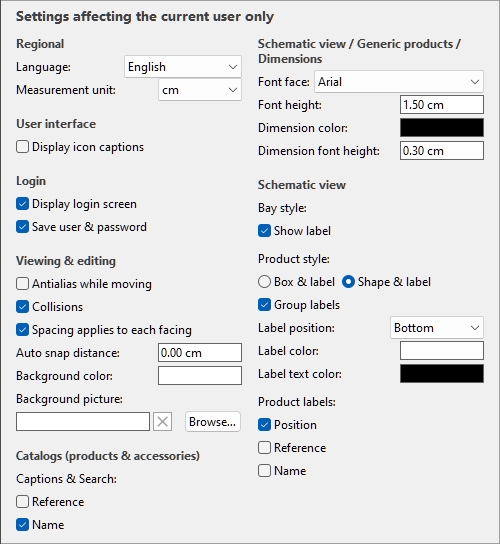
Default values shown above
Regional
Language
The language of the application.
- Supported values:
- German
- English
- Spanish
- French
- Portuguese
- Russian
- Default value: English
Note: If you wish to have the interface translated to another language, contact us at planogrambuilder@zvisuel.com.
Measurement unit
The measurement unit used in PlanogramBuilder, such as for room elements, shelving and product dimensions.
- Supported values:
mm
millimeters
cm
centimeters
inch
decimal inches
m
meters
- Default value: cm
Note: changing the measurement unit lets you enter and display the dimensions of products or shelving in your preferred unit. It does not change their actual size.
User interface
Display icon captions
Toggles the display of text captions under the buttons on toolbars.
Note: If you have a low-resolution screen or if you have set a high display scale in Windows, displaying the captions may prevent all the buttons fitting on your screen. In such case, some toolbars become scrollable to give access to the hidden buttons, but we rather advise turning off captions for ideal comfort.
Login
Video tutorial on this topic: 3: Startup settings
Display login screen
Toggles the visibility of the application login screen.
- Supported values:
- Checkmarked: this forces PlanogramBuilder to always show the login screen.
- Not checkmarked: the login screen is bypassed (Save user & password must also be checkmarked).
- Default value: Not checkmarked
Save user & password
Toggles remembering the username and password for subsequent logins.
- Supported values:
- Checkmarked: the application remembers the last entered username and password, so you don’t have to type them again.
- Not checkmarked: you must always enter your username and password when opening PlanogramBuilder.
- Default value: Checkmarked
Viewing & editing
Antialias while moving
Toggles antialiasing (edge smoothing) while interacting with the planogram visualization.
- Supported values:
- Checkmarked: the on-screen planogram visualization is always antialiased (smoothed) even while navigating the view or moving items in your planogram.
- Not checkmarked: the on-screen planogram visualization is antialiased only when static. The image quality is a little harsher while moving objects or the view. Choose this setting if you experience slow response while moving the view or objects.
- Default value: Not checkmarked
Collisions (Settings)
Controls collision detection for all items and elements in PlanogramBuilder. Collision detection mimics the real world by preventing any overlap between objects. Items can also be pushed by other items when moving them.
- Supported values:
- Checkmarked: collision detection is activated, and the items cannot overlap.
- If the desired item position overlaps another item, the item you are positioning pushes the other item(s) to make space if there is, or it can be blocked by the other item if there is no room to push it further.
- If the desired item position overlaps a bay component, the item you are positioning collides and is blocked by the bay component.
- Not checkmarked: collision detection is deactivated. All items can be placed freely and overlap.
- Default value: Checkmarked
Tip: As an alternative to de-activating collision detection in the settings, you can disable collisions temporarily by holding down the C key on your keyboard while moving or dragging items on shelves. This is useful to prevent pushing items around while moving them on the shelves.
Spacing applies to each facing
Toggles the effect of spacing when using spacing commands on same products within blocks.
- Affected commands:
- Supported values:
- Checkmarked: All the products are redistributed in space no matter if they are part of a block of the same products. All gaps between products within product blocks are also adjusted to match the desired distribution. Use this setting if you want to obtain an even spacing between products, including those part of a same product block.
- Not checkmarked: The groups of the same products are treated as single entities. The gaps between individual products within blocks are however maintained as in the original block. Choose this setting if you want to obtain an even spacing between product blocks, while being able to adjust separately the spacing between products inside blocks.
- Default value: Checkmarked
- Examples: Both values are illustrated in Align and space (products and accessories).
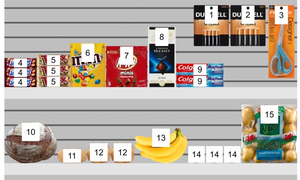
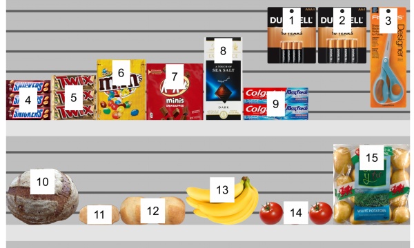
Auto snap distance
Determines the threshold at which an item is automatically re-positioned to touch its nearest neighbor when you drag, move or copy it on a shelf.
Also determines the threshold at which an item will automatically be re-positioned precisely at a lateral edge of the shelf, when you drag, move or copy it.
- Supported values: positive numeric value [0-9 and decimal point] (according to Measurement unit)
- Default value: empty (= 0)(no auto snapping)
- Example: 1.5
Examples:
- If you set the distance to 4 cm, a product placed further than 4 cm away from another product will stay where you place it.
- If you set the distance to 4 cm, a product placed closer than 4 cm away from another product will jump and snap adjacent to that product.
- If you set the distance to 4 cm, a product placed closer than 4 cm away from the lateral edge of a shelf will jump and snap aligned to the shelf lateral edge.
Note: This setting only affects products and accessories that are placed on shelves (standard, stackable, tester). Other items don’t snap together (e.g., pegged, panel, bay header).
Tip: If you want to be able to place products very close to each other without snapping them together, enter a value of 0 in the setting.
Background color
Sets the background color the visualization area
- Supported values: any color picked from the color palette
- Default value: white
- Example: orange
Instructions:
- Click on the color swatch on the right of Background color.
- Pick any color from the color palette.
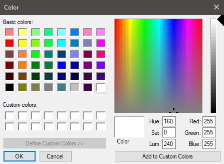
- Click OK to confirm.
Notes:
- When you change this setting, the latest color is saved in your account and re-used for new projects.
- The current background color is also used in .
- The current background color is NOT used in , which have their own background color setting.
Background picture
Defines a background image for your planograms.
- Supported values: file path of image file in supported format (jpg, png, bmp, gif, tif)
- Default value: empty (= none)
- Example: C:\Desktop\my_shop_wall.jpg
Instructions:
- Click on Browse.
- Select the desired image file on your PC.
- Click on Open.
- Wait for the image to upload.
To remove the background image, click on the small red cross button.
Notes:
- This setting is saved per user and applies to all projects.
- The background image is also used in .
- The background image is NOT used in .
Warning: If you delete the image from your computer, or if you open PlanogramBuilder from a different computer, the background image won’t be displayed.
Tip: If you have taken a photograph of the store area where your project will be implemented, you can use a photo as the background and see your project in situation.
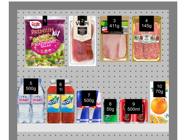
Catalogs (products & accessories)
Captions & Search
Sets the property values displayed as text description below each thumbnail in Catalog of products and in Catalog of accessories. The selected properties also apply to text search of items in the catalogs based on their corresponding values (consult Search by text (Catalog of products)).
- Supported values:
- Reference
- Name (consult Name (Item properties))
- Item custom properties [1 – 12]
- Default value: Name
- Example:
- Reference
- Weight
Note: This setting doesn’t apply to Template catalog, which always shows project names.
Schematic view / Generic products / Dimensions
Font face (Settings)
Sets the typeface for various texts displayed in PlanogramBuilder.
- Affected texts:
- Text labels of Generic products. Consult Insert generic product.
- Text labels of products without Image.
- Text labels of all products when Schematic view is checkmarked.
- Dimension texts when View dimensions is checkmarked.
- Supported values: fonts installed on your computer
- Default value: Arial
- Example: Tahoma
Font height
Sets the text size for various texts displayed in PlanogramBuilder. For example, it may be necessary to use a smaller text size if your product labels cannot be displayed fully with the default text size.
- Affected texts:
- Text labels of Generic products. Consult Insert generic product.
- Text labels of products without Image.
- Text labels of all products when Schematic view is checkmarked.
- Supported values: positive numeric value [0-9 and decimal point]
- Default value: 2 cm, 20 mm, 0.79 inches (according to Measurement unit)
- Example: 1.2
Tip: You can also adjust the font size interactively with a menu tool: Font size.
Dimension color
Sets the color of the dimension lines and text when is checkmarked.
- Supported values: any color picked from the color palette
- Default value: white
- Example: orange
Instructions:
- Click on the color swatch on the right of Dimension color.
- Pick any color from the color palette.
- Click OK to confirm.
Dimension font height
Sets the font height for dimension value texts when is checkmarked. The size of the dimension line arrows is also adjusted accordingly.
- Supported values: positive numeric value [0-9 and decimal point]
- Default value: 0.3 cm, 3 mm, 0.12 inches (according to Measurement unit)
- Example: 0.4
Tip: The default value corresponds to standard dimension lines and text sizes, so you should only need to change this value when outputting images which will be printed in very large format.
Warning: In the visualization area of Publish, the onscreen dimension text size doesn't actually correspond to the set value, but rather to a scaled preview based on the value of Resolution (Single pictures).
Schematic view (Settings)
Use the settings below to customize the appearance of items when is checkmarked.
Bay style
Show label
Toggles the display of labels on Bay when is checkmarked.
- Supported values:
- Checkmarked: shows the name of Bay on a label as shown below. Consult to find out how to assign the name.
- Not checkmarked: no label is shown on Bay.
- Default value: Not checkmarked
Example:
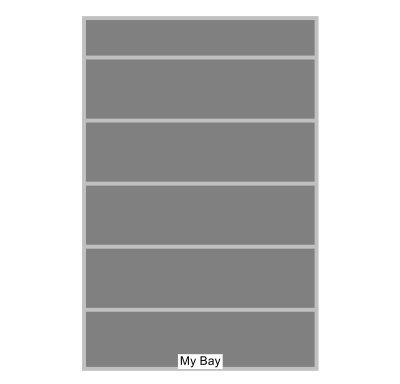
Show label: checkmarked
Product style
The visual style of products when is checkmarked.
- Supported values:
- Box & label: displays products as simple boxes with their caption printed on the front face.
- Shape & label: displays products looking as defined in the database with Image, with the addition of a caption on a label.
- Default value: Box & label
Examples:
Product style: Box & label
Product style: Shape & label
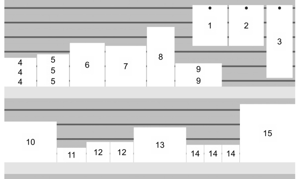
Group labels
Toggles combining labels on products within blocks of same products, when is checkmarked.
- Supported values:
- Checkmarked: Labels are combined within each block of the same products. The exact effect depends on the setting of Product style:
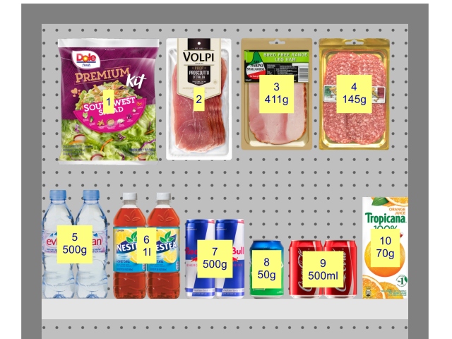
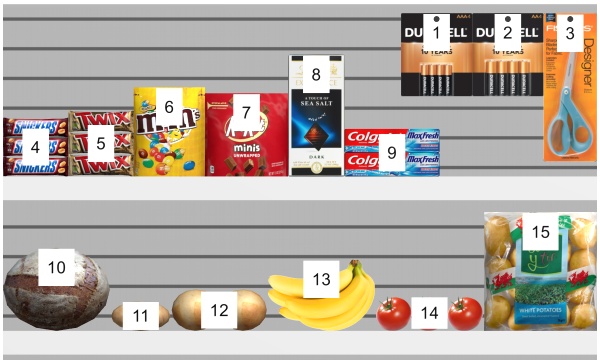
- Product style: Box & label: labels are only grouped vertically (e.g., product 5 below). To help visually identify the products, they are not grouped horizontally (e.g., product 14 in below example):
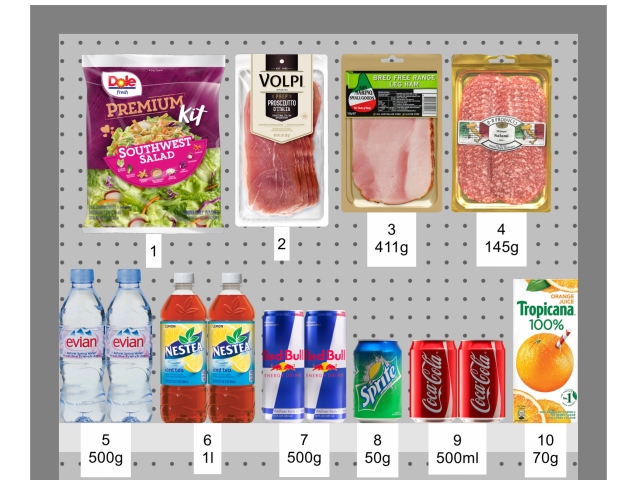
- Product style: Shape & label: a single label is displayed for each block of same products.
- Not checkmarked: A distinct label is displayed on each item, even within blocks of the same products.
- Default value: Not checkmarked
Examples:

Group labels: checkmarked (Product style: Box & label)
Group labels: checkmarked (Product style: Shape & label)
Label position
The vertical position of labels relative to each product, when is checkmarked.
- Supported values:
- Above: the label lower edge is placed at the product upper edge (available only with Product style: Shape & label).
- Top: the label upper edge is placed at the product upper edge.
- Center: the label is placed at the center of the product.
- Bottom: the label lower edge is placed at the product lower edge.
- Below: the label upper edge is placed at the product lower edge. In this case, the label is also moved forward in front of the shelf to preserve readability (available only with Product style: Shape & label).
- On shelf/peg: the label positions resemble the way labels are physically placed in stores. The position varies depending on product style and the product behavior.
- Pegged products: the label lower edge is placed at the product upper edge.
- Other products: the label upper edge is placed at the product lower edge.
- Product style: Box & label:
- Pegged products: the label upper edge is placed at the product upper edge.
- Other products: the label lower edge is placed at the product lower edge.
Tip: Combined with Product style: Shape & label, On shelf/peg resembles the way labels are physically placed in stores.
Examples:
Label position: On shelf/peg
Label position: Top
Label position: Center
Label position: Below
Label color
The color of the label background, when is checkmarked.
Only applicable if Product style is set to Shape & label
- Supported values: any color picked from the color palette
- Default value: white
- Example: orange
Instructions:
- Click on the color swatch on the right of Label color.
- Pick any color from the color palette.
- Click OK to confirm.
Label text color
Sets the color of the label text, when is checkmarked.
Only applicable if Product style is set to Shape & label
- Supported values: any color picked from the color palette
- Default value: black
- Example: blue
Instructions:
- Click on the color swatch on the right of Label text color.
- Pick any color from the color palette.
- Click OK to confirm.
Product labels
The information shown on product labels, when is checkmarked.
- Supported values:
- Default value: Name
- Example:
- Position
- Reference
Examples:
Product labels: Position