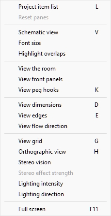
View
This section lets you control the display of interface panels and planograms on screen.
Tools and commands (View)
The toolbar includes the following buttons:

They are also available in Main Menu > View:
Note: most of the above toggles can also be controlled via checkboxes (cf. Visualization > View parameters).
Project item list (toggle)
This toggles displaying the list of products and accessories in your current planogram. cf. the description of this pane in the dedicated section: Project item list.
- Keyboard shortcut: L
- Supported values:
- Pressed (checkmarked): Project item list is displayed on screen.
- Not pressed (not checkmarked): Project item list is not displayed.
- Default value:
- In the task named Publish: Pressed (checkmarked)
- In other tasks: Not pressed (not checkmarked)
Note: The list can also be closed by clicking on the cross icon in its upper right corner.
Reset panes
This command resizes and repositions all the user interface panes to their default values.
View labels
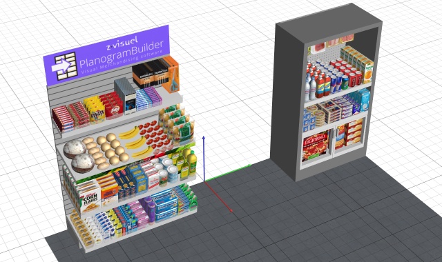
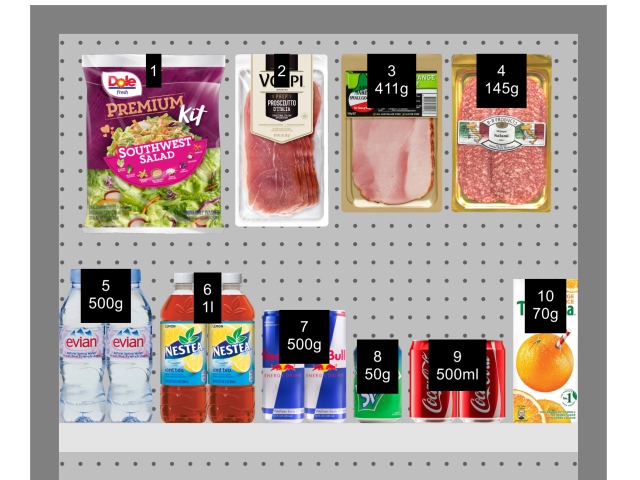
This button and menu item toggles the visibility of labels on products and accessories. (also available as a checkbox in View parameters.)
- Keyboard shortcut: V
- Supported values:
- Pressed (checkmarked): labels are displayed.
- Not pressed (not checkmarked): labels are not displayed.
- Default value: Not pressed (not checkmarked)
Notes:
- You can set the style and content of labels (cf. Visualization > Labels).
- The text labels are orientated horizontally except if they better fits vertically, typically on products which are thin and tall.
- The text labels appear on the surface of the items most closely facing the viewpoint. For example:
-
- The labels are shown on the front of items when looking from the front.
- The labels are shown on the top of items when looking from above.
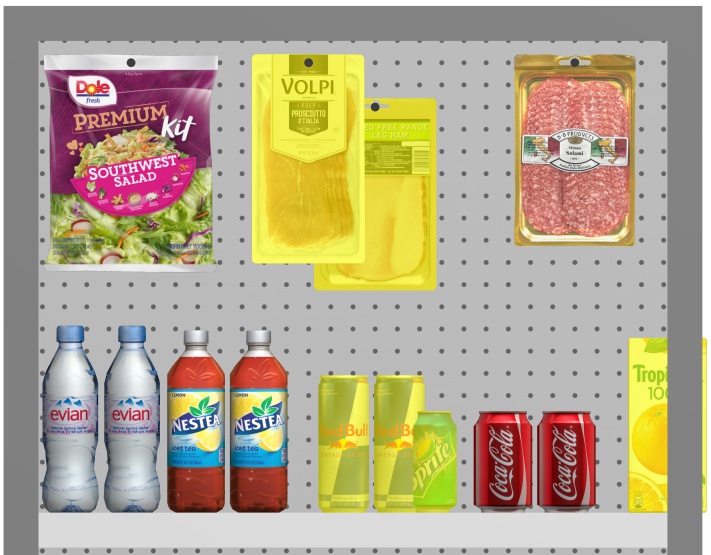
Example of View labels
Font size (tool)
Use this tool to adjust the size of labels with your mouse.
Instructions:
- Display the labels with View labels.
- Activate Font size (tool) from the menu or the toolbar button.
- Place your mouse cursor in the visualization area.
- Press and hold the left mouse button.
- Move your mouse left, right, up or down. The text size changes.
- Release the mouse button.
- Activate another tool to exit this feature. E.g., Zoom
To set the text size back to its default value:
- Activate the tool from the menu.
- Place your mouse cursor with the visualization area.
- Click the left mouse button.
- Activate another tool to exit this feature. E.g., Zoom
Advice: You can also set the font size value precisely with the following parameter: Font height (Labels). That section also explains in detail which label texts are affected by this tool.
View as boxes
This button and menu item toggles a special display mode showing all the products and accessories in your project as a simple boxes. (also available as a checkbox in View parameters.)
- Supported values:
- Pressed (checkmarked): View as boxes is enabled.
- Not pressed (not checkmarked): View as boxes is disabled.
- Default value: Not pressed (not checkmarked)
Example 1 of View as boxes

Example 2 of View as boxes
View edges
This button and menu item toggles the drawing of edge lines on objects. (also available as a checkbox in View parameters.)
This is useful to help distinguish each product and bay component in your planograms.
- Keyboard shortcut: E
- Supported values:
- Pressed (checkmarked): edge lines are drawn.
- Not pressed (not checkmarked): edge lines are not drawn.
- Default values:
- Preview in Create bays: Pressed (checkmarked)
- Visualization area:
- PlanogramBuilder light version: Pressed (checkmarked)
- PlanogramBuilder full version: Not pressed (not checkmarked)
If checkmarked, the edges are drawn for the following cases and objects:
- For all Room and bay components (including in Create bays)
- For products which use the shape: box and have no image applied. cf. Shapes for 1 image (no transparency).
- For Generic products, cf. Insert generic product.
- For all products, if View as boxes is activated.
Example with View edges and View as boxes checkmarked
Example with View edges checkmarked, but View as boxes not checkmarked
Highlight overlaps
This button and menu item toggles highlighting the products which physically overlap other items or bay components. (also available as a checkbox in View parameters.)
It is especially useful to identify overlaps in your project if Collisions (Settings) is disabled. Because in this case items can easily be mistakenly placed partially over other items.
- Supported values:
- Pressed (checkmarked): items that overlap are highlighted in yellow.
- Not pressed (not checkmarked): items that overlap are not highlighted.
- Default value: Not pressed (not checkmarked)
Example of Highlight overlaps
View the room
This button and menu item toggles the visibility of Room. (also available as a checkbox in View parameters.)
Hiding it is useful for example when it blocks the view while working with shelving or products. Supported values:
- Pressed (checkmarked): Room is visible.
- Not pressed (not checkmarked): Room is hidden.
- Default value: Pressed (checkmarked)
Note: View the room is automatically turned ON when you insert a project or a template project containing the following room elements.
View front panels
This button and menu item toggles the visibility of bay components of type: Front panel. (also available as a checkbox in View parameters.)
Hiding front panels allows selecting and editing products behind the panels, for example in case you have glass doors on a cooler. You can then display the front panels once all items behind are positioned.
- Supported values:
- Pressed (checkmarked): front panels are visible.
- Not pressed (not checkmarked): front panels are hidden.
- Default value: Pressed (checkmarked)
Note: cf. Front panel for details on such bay components.
View peg hooks
This button and menu item toggles displaying the actual hooks of pegged products. (also available as a checkbox in View parameters.)
Showing the hooks can help visualizing where the peg is located exactly, including any offset.
- Keyboard shortcut: K
- Supported values:
- Pressed (checkmarked): front panels are visible.
- Not pressed (not checkmarked): front panels are hidden.
- Default value: Pressed (checkmarked)
Example of View peg hooks
Note: To define the peg length, refer to:
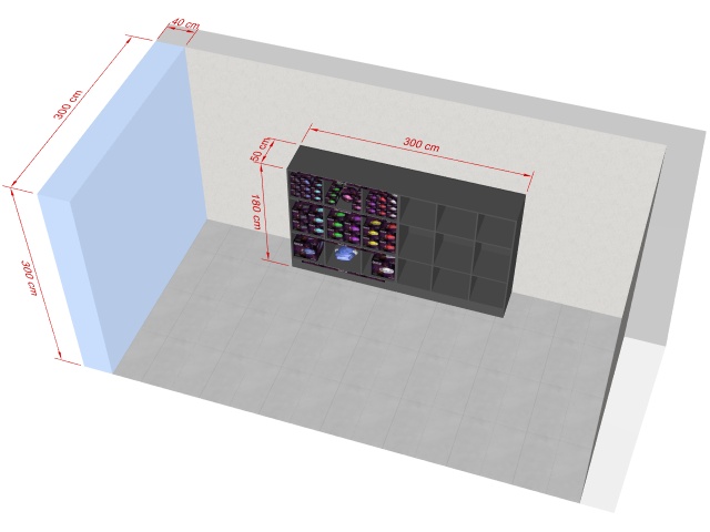
View dimensions
This button and menu item toggles the display of dimension lines and values for the objects in your planogram. (also available as a checkbox in View parameters.)
- Keyboard shortcut: D
- Supported values:
- Pressed (checkmarked): dimensions are displayed.
- Not pressed (not checkmarked): dimensions are not displayed.
- Default value: Not pressed (not checkmarked)
Depending on the context, various dimensions are displayed on screen:
By default, the overall width, depth and height are shown for each isolated bay and each group of adjacent bays:
Additionally, for each bay with at least one selected shelf, vertical shelf measures are shown. And for each bay with at least one Dividing panel selected, lateral distances between each Dividing panel are displayed, as shown below:
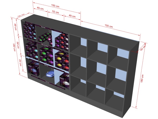
Additionally, the overall width, depth and height of each selected room element are also displayed, as shown below:
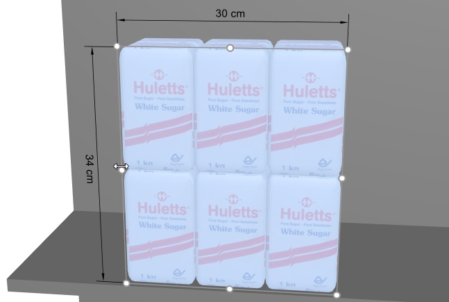
The dimensions of any bay, bay component or block of products are also displayed when clicking on one of its round handles in the corresponding editing mode, as shown below:
Note: a dimension is only displayed if the viewing angle and the available space allows. If you can’t see a desired dimension, use Zoom, Orbit, Pan tools to adjust the view accordingly.
View flow direction
This button and menu item toggles the display of arrows indicating the direction of traffic at the base of each bay in your project. (also available as a checkbox in View parameters.)
This command has no effect on bays for which Flow direction hasn't been defined. cf. Flow direction for details on how to set the flow direction for your bays.
- Supported values:
- Pressed (checkmarked): front panels are visible.
- Not pressed (not checkmarked): front panels are hidden.
- Default value: Not pressed (not checkmarked)
View grid
This button and menu item toggles the display of a grid helper on the floor plane. (also available as a checkbox in View parameters.)
- Keyboard shortcut: G
- Supported values:
- Pressed (checkmarked): the grid is displayed.
- Not pressed (not checkmarked): no grid is displayed.
- Default value: Not pressed (not checkmarked)
Stereo vision
This menu item toggles displaying your planogram in stereoscopic anaglyph mode. You will need a pair of red/cyan glasses to perceive the 3D depth of the view.
- Supported values:
- Checkmarked: the planogram is displayed in stereographic anaglyph mode.
- Not checkmarked: the planogram is displayed without stereo effect.
- Default value: Not checkmarked
Note: this command is only available in the menu, not as a toolbar button.
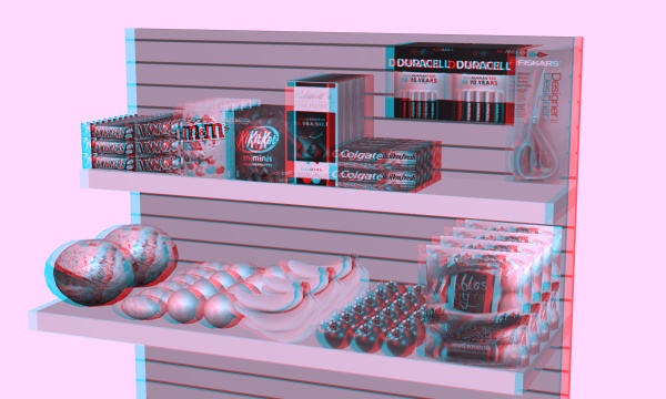
Stereo effect strength
This menu tool lets you adjust the amount of stereo effect if Stereo vision is checkmarked. It does so by changing the separation distances between the left and right images. This helps match your physical eye separation.
Instructions:
- Click on this command: Stereo vision.
- Put your red/cyan glasses on.
- Activate this tool: Main Menu > View > Stereo effect strength.
- While holding the left mouse button down in the visualization area, move your mouse up or down to increase or decrease the effect.
Note: This command is only available in the menu, not in the toolbar.
Tips:
- We advise using a minimal effect to avoid ghost images and headaches.
- While the tool is active, you can click on the visualization area to reset the default value.
Lighting intensity (tool)
This tool lets you adjust the amount of light in your planogram.
Instructions:
- Activate this tool from: Main Menu > View.
- While holding the left mouse button down in the visualization area, move your mouse up or down to increase or decrease the lighting.
Note: While the tool is active, you can click on the visualization area to reset the default value.
Advice: You can also set the exact value with Intensity (Lighting parameter).
Lighting direction (tool)
This tool lets you adjust the orientation of the light in your planogram.
Instructions:
- Activate this tool from: Main Menu > View.
- While holding the left mouse button down in the visualization area, move your mouse in any direction to change the direction of lighting.
Note: While the tool is active, you can click on the visualization area to reset the default value.
Full screen
This button and menu item toggles the full screen mode.
- Keyboard shortcut: F11: toggles Full screen
In this mode, the planogram visualization is maximized to fill the whole screen.
You can still use commands for Edit, View and Camera from the toolbars and from the main context menu.
Mouse & keyboard shortcuts can still be used to perform any supported actions.
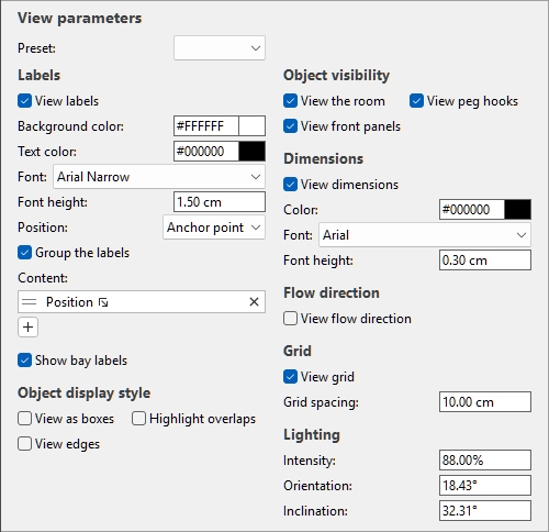
View parameters
This pane contains parameters to configure what objects are visible and how they are displayed in the visualization area.
Presets (View parameters)
Your current settings for View parameters can be saved and retrieved as presets.
Preset (View parameters)
A drop-down list where you can select a saved preset. If a saved preset is currently used, its name is displayed.
The list of presets saves parameters per user. The presets saved here are available to you with any planogram project.
Create a preset (View parameters)
- Under View parameters, adjust the view parameters as desired.
- Right-click anywhere within the View parameter panel.
- In the context menu, choose Presets > Save as.
- Type the name of the preset to save in the text box.
- Click Save.
- The saved preset is now available in the drop-down list.
Apply a preset (View parameters)
- Select a preset in the drop-down list to load it.
- The view parameters changes to match the loaded preset.
Delete a preset (View parameters)
- Select a preset in the drop-down list to load it.
- Right-click anywhere within the View parameter panel.
- In the context menu, choose Presets > Delete.
Labels
Labels with customizable text can be displayed as overlays on products, accessories and furniture.
The labels help identify these items when editing and publishing planograms.
View labels
This checkbox toggles label visibility, exactly as the corresponding button and menu item. cf. View labels.
Background color (Labels)
The background color of labels.
Note: Only editable if View labels is checkmarked.
Note: this color doesn’t apply to products and accessories if View as boxes is checkmarked.
The color can be specified as follows:
Color text field:
- Supported values: HTML color codes (with or without the # prefix, not case-sensitive). Complete reference of theses HTML color codes can be found for example at:
- Default value: #FFFFFF (white)
- Example: 000000 (black)
Color sample:
- Click on the color sample next to Color to display the color palette.
- Select the desired color.
- Click OK.
Text color (Labels)
The text color of labels.
Note: Only editable if View labels is checkmarked.
Note: this color doesn’t apply to products and accessories if View as boxes is checkmarked.
The color can be specified as follows:
Color text field:
- Supported values: HTML color codes (with or without the # prefix, not case-sensitive). Complete reference of theses HTML color codes can be found for example at:
- Default value: #000000 (black)
- Example: FFFFFF (white)
Color sample:
- Click on the color sample next to Color to display the color palette.
- Select the desired color.
- Click OK.
Font (Labels)
The typeface of labels.
It also controls the font of texts displayed on generic products and products without images which use the following shape: box.
- Supported values: fonts installed on your computer
- Default value: Arial
- Example: Tahoma
Font height (Labels)
Sets the font height for label texts.
It also controls the height of texts displayed on generic products and products without images which use the shape named box.
- Supported values: positive numeric value [0-9 and decimal point]
- Default value: 2 cm, 20 mm, 0.79 inches, 0.02 m (according to Measurement unit)
- Example: 1.4
Advice: You can also adjust this value interactively. cf. Font size (tool).
Position (Labels)
The position of labels relative to each product or accessory.
Note: Only editable if View labels is checkmarked.
- Supported values:
- Above: the label lower edge is placed at the item upper edge. Note: not available if View as boxes is checkmarked.
- Top: the label upper edge is placed at the item upper edge. The label upper edge always remains below the hook for pegged products.
- Center: the label is placed at the center of the item. The label upper edge always remains below the hook for pegged products.
- Bottom: the label lower edge is placed at the item lower edge. The label upper edge always remains below the hook for pegged products.
- Below: the label upper edge is placed at the item lower edge. In this case, when viewing from the front, the label is also moved forward in front of the shelf to preserve readability. Note: not available if View as boxes is checkmarked.
- Anchor point: uses Bottom position for products on shelves, and Top position for products on pegs (the anchor point of each product). This results in labels being nicely aligned on all rows.
- On shelf/peg: when viewing from the front, the label positions resemble the way labels are physically placed in stores. Note: not available if View as boxes is checkmarked. The position varies depending on the following:
- Pegged items: the label upper edge is placed at the item upper edge.
- Other items: the label lower edge is placed at the item lower edge.
Advice: When viewing from the front, On shelf/peg resembles the way labels are physically placed in stores.
Examples:
Position (Labels): On shelf/peg
Position (Labels): Top
Position (Labels): Center
Position (Labels): Below
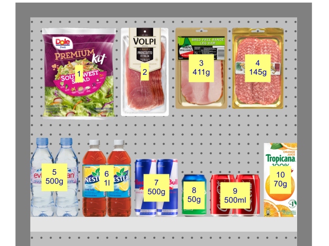
Group the labels
This checkbox toggles combining labels on products within blocks of same products.
Note: Only editable if View labels is checkmarked.
- Supported values:
- Checkmarked: Labels are combined within each block of the same product. The exact effect varies:
- If View as boxes is not checkmarked: a single label is displayed for each block of the same product.
- If View as boxes is also checkmarked: labels are only grouped vertically (e.g., product 5 below). To help visually identify the products, they are not grouped horizontally (e.g., product 14 in below example):
- Not checkmarked: A distinct label is displayed on each item, even within each block of the same product.
- Default value: Not checkmarked
Examples:
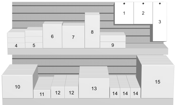
Group the labels: checkmarked (with View as boxes)
Group the labels: checkmarked (without View as boxes)
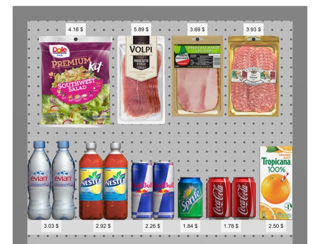
Content (Labels)
Here you can choose and organize the information to display on the labels.
Note: Only editable if View labels is checkmarked.
You can display one or several lines of information on each label. Each line is represented by a white tile such as this example:
Add a content to the labels
- Click on the button with a + sign.
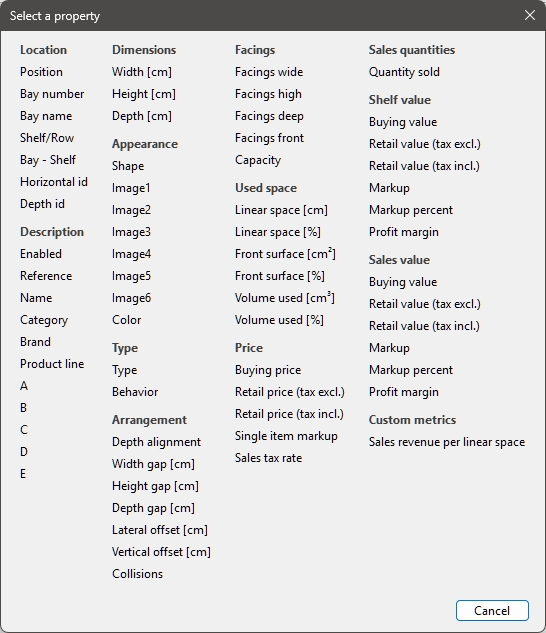
- A dialog window opens, showing the list of available content. cf. Columns (Project item list) for details since the same choices are described there.
- Select a content to display on the labels (for example Location).
- The dialog window closes.
- The newly created label content is represented by a new tile such as this one:
- The actual values are displayed on the labels of products and accessories in your planogram.
Modify a content of the labels
- Click on the tile name.
- A dialog window opens, showing the currently selected information.
- Select a different information.
- The dialog window closes.
- The updated label content is represented on the corresponding tile.
- The updated values are displayed on the labels of products and accessories in your planogram.
Re-order content of the labels
- If you have several tiles, grab the two lines on the tile and drag it up or down.
- The tile is repositioned and the order changed.
- The labels are updated on products and accessories.
Delete a content of the labels
- Click on the X on the tile.
- The tile is deleted.
- The labels are updated on products and accessories.
Examples:
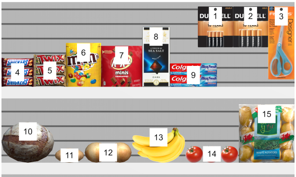
Content (Labels): Location
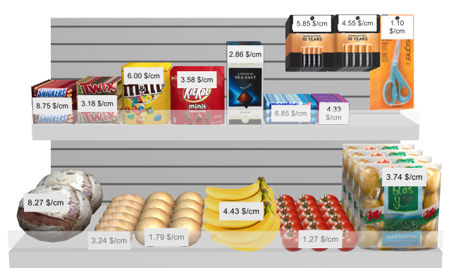
Content (Labels): revenue per linear space. cf. Custom metrics (Project analysis).
Show bay labels
This checkbox toggles the display of labels on Bay if View labels is checkmarked.
- Supported values:
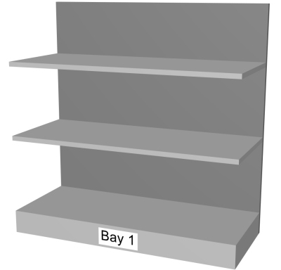
- Checkmarked: shows the name of Bay on a label as shown below. cf. Bay name to find out how to assign the name.
- Not checkmarked: labels on Bay are not shown.
- Default value: Not checkmarked
Note: The text labels appear on the surface of the bays most closely facing the viewpoint. For example:
- The labels are shown on the front of bays when looking from the front.
- The labels are shown on the top of bays when looking from above.
Example:
Show bay labels: checkmarked
Object display style
These checkboxes control the visual aspect of objects in the visualization area, exactly as the corresponding buttons and menu items. Consult:
Object visibility
These checkboxes control the visibility of various objects in the visualization area, exactly as the corresponding buttons and menu items. Consult:
Dimensions
Dimensions can be displayed in your planograms to assist you when placing products, building or resizing shelving and room elements.
View dimensions
This checkbox toggles the visibility of dimensions, exactly as the corresponding button and menu item. cf. View dimensions.
Color (Dimensions)
Sets the color of the dimension lines and text if View dimensions is checkmarked.
The color can be specified as follows:
Color text field:
- Supported values: HTML color codes (with or without the # prefix, not case-sensitive). Complete reference of theses HTML color codes can be found for example at:
- Default value: #000000 (black)
- Example: #FFFFFF (white)
Color sample:
- Click on the color sample next to Color to display the color palette.
- Select the desired color.
- Click OK.
Font (Dimensions)
Sets the font height for dimension value texts if View dimensions is checkmarked. The size of the dimension line arrows is also adjusted accordingly.
- Supported values: positive numeric value [0-9 and decimal point]
- Default value: 0.3 cm, 3 mm, 0.12 inches (according to Measurement unit)
- Example: 0.4
Advice: The default value corresponds to standard dimension lines and text sizes, so you should only need to change this value when outputting images which will be printed in very large format.
Warning: In the visualization area of Publish, the onscreen dimension text size doesn't actually correspond to the set value, but rather to a scaled preview based on the value of the following parameter: Resolution (Single pictures).
Font height (Dimensions)
Sets the font height for dimension texts if View dimensions is checkmarked. The size of the dimension line arrows is also adjusted accordingly.
- Supported values: positive numeric value [0-9 and decimal point]
- Default value: 0.3 cm, 3 mm, 0.12 inches (according to Measurement unit)
- Example: 0.4
Advice: The default value corresponds to standard dimension lines and text sizes, so you should only need to change this value when outputting images which will be printed in very large format.
Warning: When you are in the task named Publish, the dimension text size in the visualization area doesn't actually correspond to the set value, but rather to a scaled preview based on the value of the following parameter: Resolution (Single pictures).
Flow direction
View flow direction
This checkbox toggles displaying arrows indicating the direction of traffic, exactly as the corresponding button and menu item. cf. View flow direction.
Grid
A grid can be displayed and used to position bays and room elements by snapping them on the grid lines and intersections.
View grid
This checkbox toggles displaying a grid, exactly as the corresponding button and menu item. cf. View grid.
Grid spacing
Sets the distance between thin lines on the grid. Change the value as needed.
- Supported values: positive numeric value [0-9 and decimal point]
- Default value: 10 cm, 100 mm , 5 inches (according to Measurement unit)
- Example: 20
Lighting
Here, you can control the illumination of your planograms.
Intensity (Lighting parameter)
Sets the amount of light.
- Supported values: positive percentage value [20% to 150%]
- Default value: 88%
- Example: 110%
Advice: You can also adjust this value interactively. cf. Lighting intensity (tool).
Orientation (Lighting parameter)
The angle of the light in degrees around the vertical axis.
- Supported values: positive/negative numeric value between -180 and 180 [+-0-9 and decimal point]
- Default values: 0 (the light points towards the front of the planogram)
- Example: -90 (the light points to the left side of the planogram)
Advice: The orientation can also be defined with the mouse. cf. Lighting direction (tool).
Inclination (Lighting parameter)
The angle of the light in degrees around the horizontal axis.
- Supported values: positive/negative numeric value between -90 and 90 [+-0-9 and decimal point]
- Default value: 0 (the light aims from the horizon level)
- Example: 90 (the light aims from the top)
Advice: The inclination can also be defined with the mouse. cf. Lighting direction (tool).