Selected bay components
This section lets you view and edit the properties of the selected bay components.
Some parameters are common to all type of components, while others are specific to their type, as shown below.
Advice: If all parts of your bay have the same color, it may be difficult to distinguish each component. This problem can be solved with: View edges .
Common parameters (Selected bay components)
All types of bay components share the following common properties.
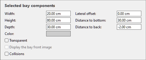
Width (Selected bay components)
The physical width of the selected components in the current measurement unit.
- Supported values: positive numeric value [0-9 and decimal point]
- Default value: selected component width
- Example: 240
Changing this value resizes the components in width.
Note: If multiple selected components have different widths, no value is displayed, but you can still assign a common value by typing it in the textbox.
Tips:
- You don't need to type the actual measurement unit (e.g., cm ), only the value.
- The width defined here can be made constant
- The width can also be defined with the mouse. cf. Resize (Edit bay components).
Height (Selected bay components)
The physical height of the selected components in the current measurement unit.
- Supported values: positive numeric value [0-9 and decimal point]
- Default value: selected component height
- Example: 2.5
Changing this value resizes the components in height.
Note: If multiple selected components have different heights, no value is displayed, but you can still assign a common value by typing it in the textbox.
Tips:
- You don't need to type the actual measurement unit (e.g., cm ), only the value.
- The height can also be defined with the mouse. cf. Resize (Edit bay components).
Depth (Selected bay components)
The physical depth of the selected components in the current measurement unit.
- Supported values: positive numeric value [0-9 and decimal point]
- Default value: selected component depth
- Example: 45
Changing this value resizes the components in depth.
Note: If multiple selected components have different depths, no value is displayed, but you can still assign a common value by typing it in the textbox.
Tips:
- You don't need to type the actual measurement unit (e.g., cm ), only the value.
- The depth can also be defined with the mouse. cf. Resize (Edit bay components).
Resizable with bay (Selected bay components)
A toggle located on the right of each dimension (Width, Height, Depth).
It determines how the corresponding component dimension is treated when the whole bay is resized (with Resize (Edit bays) or with Parameters of the whole bay (Selected bays)).
- Supported values:
- Pressed (resizable): The component dimension will be scaled proportionally when resizing the whole bay. Apply this setting for component dimensions that depend on or define the overall bay dimension, for example the height of table legs or back panels, the width of shelves or back panels.
- Not pressed (not resizable): The component dimension will not change when resizing the whole bay. Apply this setting for component dimensions that have fixed values, independent of the overall bay dimension, for example the with of table legs or side panels, the height of shelves or table tops.
- Default values:
-
- Pressed (resizable):
-
- Back panel, Front panel: Width, Height
- Shelf: Width, Depth
- Generic: Width, Height, Depth
- Not pressed (not resizable):
-
- Back panel, Front panel: Depth
- Shelf: Height
- Generic:
Examples:
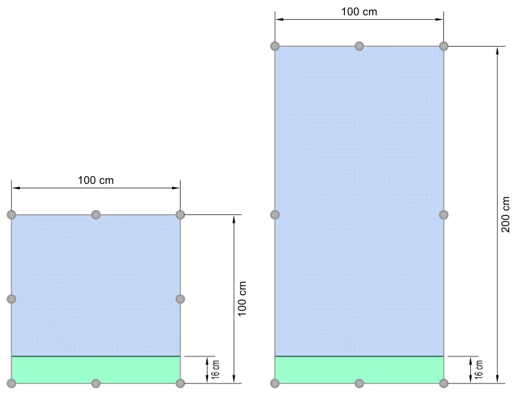
Above picture shows the effect when Resizable with bay is turned OFF (not pressed) for the height of the green component: the green component height doesn’t change after resizing the whole bay in height.
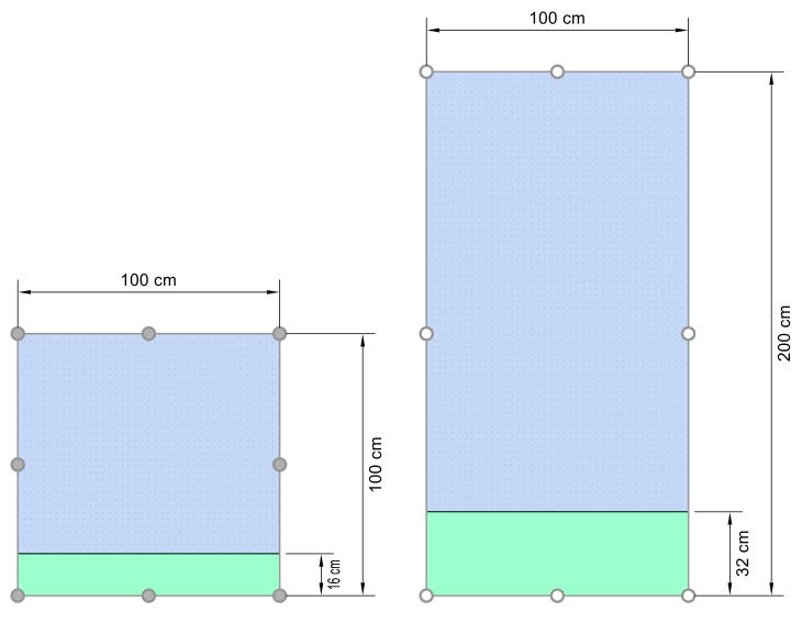
Above picture shows the effect when Resizable with bay is turned ON (pressed) for the height of the green component: the green component height is scaled proportional to the new overall bay height.
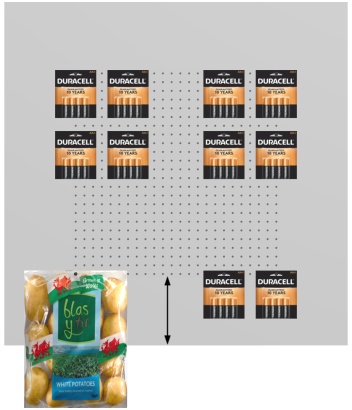
Lateral offset (Selected bay components)
The left or right offset of the selected components relative to the center of the original bay. Negative values move the component to the left; positive values move it to the right.
- Supported values: positive/negative numeric value [+-0-9 and decimal point]
- Default value: 0
- Example: -24
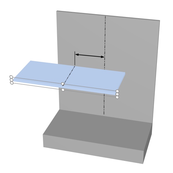
The arrow represents Selected bay components
Advice: You can also move the components with the mouse. cf. Move (Edit bay components).
Warning: Do not use this parameter to move an entire bay (by offsetting all its components). Use instead Position Y (Selected bays) for this purpose.
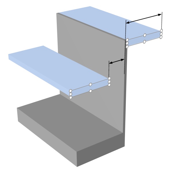
Distance to bottom
The vertical distance from the bottom of the selected components to the bottom of the bay. Shelves are an exception for which the distance is measured from the top of the shelf, making it easier to specify the actual position of the shelf surface relative to the bottom of the bay (typically the floor).
- Supported values: positive/negative numeric value [+-0-9 and decimal point]
- Default value: no default value
- Example: 64.25
The arrows represent Distance to bottom
Advice: Distance to bottom can also be defined with the mouse. cf. Move (Edit bay components).
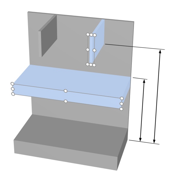
Distance to back
The distance from the back of the selected components to the bay origin (normally the rear of shelves after the initial creation of bay).
- Supported values: positive/negative numeric value [+-0-9 and decimal point]
- Default value: 0
- Example: 10
The arrows represent Distance to back
Color (Selected bay components)
The color of the selected components.
The color can be specified as follows:
Color text field:
- Supported values: HTML color codes (with or without the # prefix, not case-sensitive). Complete reference of theses HTML color codes can be found for example at:
- Default value: #CCCCCC (light gray)
- Example: FF8000 (orange)
Color sample:
- Click on the color sample next to Color to display the color palette.
- Select the desired color.
- Click OK.
Transparent
Specifies whether the selected components are translucent or opaque.
- Supported values:
- Checkmarked: translucent components.
- Not checkmarked: opaque components.
- Default value: Not checkmarked
Advice: To simulate glass, checkmark this and set Color (Selected bay components) to white.
Display the bay front image
Determines if the front image of the bay is displayed on the front of the selected components.
- Supported values:
- Checkmarked: the image is displayed on the selected components.
- Not checkmarked: the image is not displayed on the selected components.
- Default values:
- For Base, Top panel, Side panels: Checkmarked
- For Back panel, Dividing panel, Front panel, Shelf: Not checkmarked
Note: cf. Front image for details on assigning the image to the bay.
Collisions (Selected bay components)
Determines if the selected bay components will block products and accessories when they are moved against it/them. This parameter has no effect when moving bay components against each other; bay components can always overlap with one another.
- Supported values:
- Checkmarked: products and accessories collide against the selected components.
- Not checkmarked: products and accessories don't collide against the selected components.
- Default value: Not checkmarked
Advice: Checkmark this for components which should act as a physical barrier for products, such as vertical separations.
Note: This parameter has no effect without Collisions (Settings) checkmarked.
Parameters (Selected shelves)
Shelves have additional specific parameters described below.
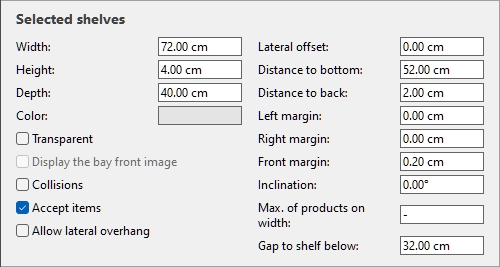
Inclination (Selected shelves)
The angle of the selected shelves in degrees around the horizontal axis (Y).
- Supported values: positive/negative numeric value [+-0-9 and decimal point]
- Default value: 0 (the shelf is horizontal)
- Example: -15
Note: All products on the shelf will also be leaning.
Gap to shelf below
The vertical space between each selected shelf and the shelf just below. This is convenient to ensure enough vertical space based on your product heights.
- Supported values: positive numeric value [0-9 and decimal point] (based on Measurement unit)
- Default value: the existing gap if applicable.
- Example: 30.5
Note: Entering a value for this parameter overwrites Distance to bottom.
Note: This parameter is not available for the lowest shelf of a bay.
Advice: Select several shelves and apply the same value to quickly obtain regularly spaced shelves.
Accept items (Selected shelves)
Defines whether you can place products and accessories on the selected shelves.
- Supported values:
- Checkmarked: products and accessories can be placed on the selected shelves.
- Not checkmarked: products and accessories can't be placed on the selected shelves.
- Default value: Checkmarked; or the value chosen at creation (Create bays)
Shelf type
The type of shelf defines the way products can be placed on the shelf.
- Supported values:
- Gondola shelf: A typical store shelf as in shelf racks or shelf units.
-
- Products are aligned either to the front or rear margin of the shelf. Different products cannot be placed behind each other, unless you place products of the type tester in front of other products, or unless you mix products aligned to the front and to the back of the shelf (Depth alignment).
- Products are placed by default with multiple facings on the shelf depth.
- Products are placed standing up on the shelf.
- Refrigerated chest: A shelf type to place products as in a trunk cooler.
-
- Products can be placed freely at any location on the shelf. You can put different products behind each other and they don’t have to be aligned.
- Products are placed by default as single facings on the shelf.
- Products are placed lying down on the shelf.
- Table top: A shelf type to place products as on a table, a counter top or a sales bin.
-
- Products can be placed freely at any location on the shelf. You can put different products behind each other and they don’t have to be aligned.
- Products are placed by default as single facings on the shelf.
- Products are placed standing up on the shelf.
- Default value: Gondola shelf
Note: After changing Shelf type, the orientation of products already on the shelf is automatically adjusted as per the above specifications if applicable.
Advice: you can find various examples of shelving units in Template catalog > Predefined examples (Template catalog).
Examples:
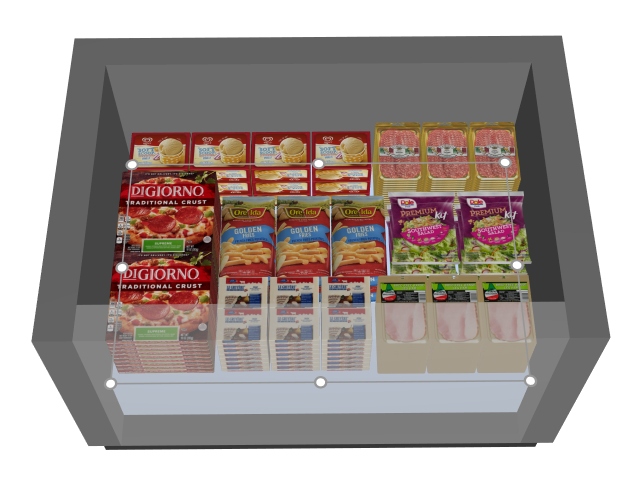
Shelf type: Gondola shelf
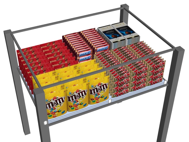
Shelf type: Refrigerated chest
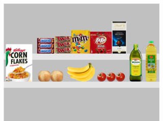
Shelf type: Table top
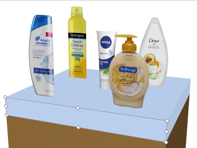
Shelf type: Table top
Behind products
Only applicable to PlanogramBuilder Light version.
Determines if the selected shelves are moved behind products that are positioned on lower shelves.
Since the depth of shelves cannot be specified in the Light version, this parameter is useful to simulate shelves that are shorter than others, thereby allowing tall products on deep shelves placed in front of short shelves above.
- Supported values:
- Checkmarked: the selected shelves are shown behind (doesn't cover) products placed on shelves below.
- Not checkmarked: the selected shelves partially cover products placed on shelves below.
- Default value: Not checkmarked
Behind products: Checkmarked
Behind products: Not checkmarked
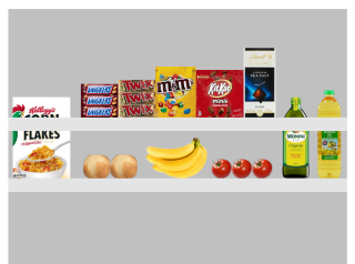
Max. of products on width
Only applicable to Shelf
The maximum number of products that can be placed along the width of the shelf.
A block of multiple same products also counts as one product.
- Supported values: positive numeric value [0-9] (based on Measurement unit)
- Default value: - (= no maximum. You can place as many products as fit on the shelf.)
- Example: 3
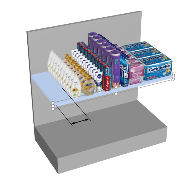
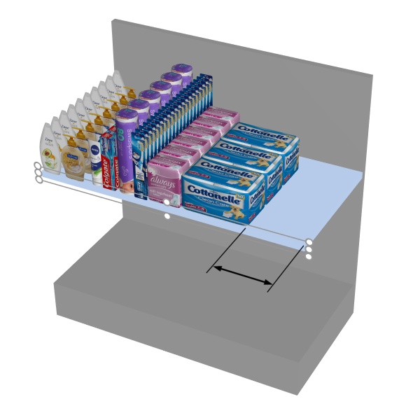
Allow lateral overhang (Selected shelves)
Only available for Gondola shelf (cf. Shelf type)
Determines if products and accessories can overhang the side edges of the selected shelves. This also allows placing products straddling two adjacent shelves, even across separate bays.
- Supported values:
- Checkmarked: items can extend past the lateral edges of the shelves, but only by maximum half the item width.
- Not checkmarked: items cannot extend past the lateral edges of the shelves.
- Default value: Not checkmarked
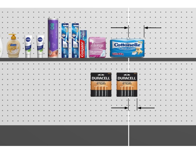
Arrows showing products overhanging a shelf and a back panel (Allow lateral overhang (Selected back panels)).
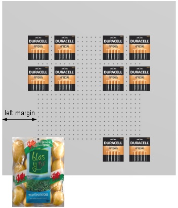
Left margin (Selected shelves)
The distance from the left edge of the shelf beyond which products cannot be placed.
- Supported values: positive numeric value [0-9 and decimal point] (based on Measurement unit)
- Default value: 0
- Example: 15
The default value of 0 lets you place products all the way to the left edge of the shelf.
A value of 8 lets you place products on the whole shelf except on the last 8 mm/cm/m/inches on the left part of the shelf.
The arrow represents Left margin on a shelf.
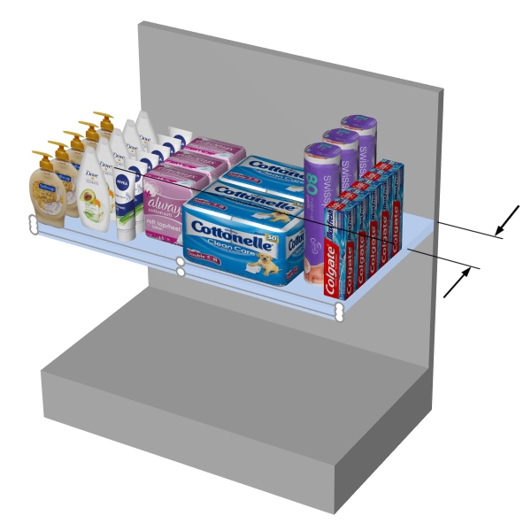
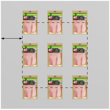
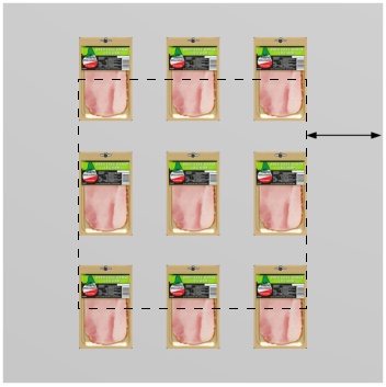
Right margin (Selected shelves)
The distance from the right edge of the shelf beyond which products cannot be placed.
- Supported values: positive numeric value [0-9 and decimal point] (based on Measurement unit)
- Default value: 0
- Example: 15
The default value of 0 lets you place products all the way to the right edge of the shelf.
A value of 10 lets you place products on the whole shelf except on the last 10 mm/cm/m/inches on the right part of the shelf.
The arrow represents Right margin
Back margin (Selected shelves)
The distance at which products can be placed from the rear edge of shelves.
This is useful if you want to leave some space for accessories at the rear of the shelves.
- Supported values: positive/negative numeric value [+-0-9 and decimal point] (based on Measurement unit)
- Default value: 0
- Example: 4.5
The arrows represent Back margin
Front margin (Selected shelves)
The distance at which products can be placed from the front edge of shelves.
This is useful if you want to leave some space for other items (tester, Accessory) at the front of the shelves.
- Supported values: positive/negative numeric value [+-0-9 and decimal point] (based on Measurement unit)
- Default value: 0
- Example: 8
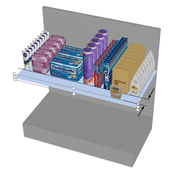
The arrows represent Front margin
Note: negative values allow products to overhang at the front edge of shelves.
Parameters (Selected back panels)
Back panels have additional specific parameters described below.
Accept items (Selected back panels)
Defines whether you can place products and accessories on the selected back panels.
- Supported values:
- Checkmarked: products and accessories can be placed on the selected back panels.
- Not checkmarked: products and accessories can't be placed on the selected back panels.
- Default value: Checkmarked; or the value chosen at creation (Create bays)
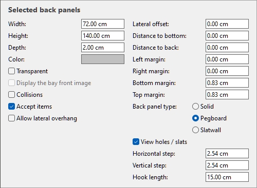
Back panel type
The type of back panel.
- Supported values:
- Solid: makes the back panel a plain surface. This means pegged products can be placed and moved freely on the back panel with no constraint.
- Pegboard: turns the back panel into a pegboard. Pegged products will snap to the position of the peg holes on the back panel. By default, products are centered horizontally with the top edge aligned vertically to the peg hole. It is however possible to offset the product from the peg hole: Lateral offset (Item properties), Vertical offset.
- Slatwall: makes a panel with slats. Products snap to the slats vertically but are positioned freely horizontally.
- Default value: Solid
Examples:
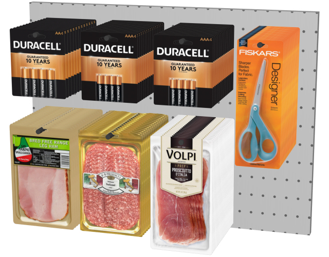
Example of Pegboard
Example of Slatwall
Horizontal step
Only available for Back panel type: Pegboard
The horizontal distance between holes on the pegboard. It acts as a snap grid increment to place pegged products.
- Supported values: positive numeric value [0-9 and decimal point] (based on Measurement unit)
- Default value: 2.54 cm (or equivalent)
- Example: 2
Vertical step
Only available for Back panel type: Pegboard, Slatwall
The vertical distance between holes or slats on the back panel. It determines the snap grid increment to hang products.
- Supported values: positive numeric value [0-9 and decimal point] (based on Measurement unit)
- Default value: 2.54 cm (or equivalent)
- Example: 6
Hook length (Selected back panels)
The distance from the back panel to the tip of pegs. The specified length is then used to determine how many times each product is repeated in depth on the hooks.
- Supported values: positive numeric value [0-9 and decimal point]
- Default value: 4 cm (or equivalent according to Measurement unit)
- Example: 2.5
Notes:
You don't need to type the actual measurement unit (e.g., cm), only the value.
Each actual hook is created and displayed automatically when you place a product on the back panel.
The hooks can also be hidden if you prefer (View peg hooks).
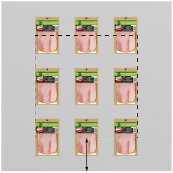
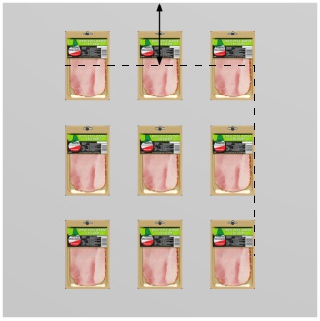
Allow lateral overhang (Selected back panels)
Determines if products and accessories can overhang the side edges of the selected back panels. This also allows placing products straddling two adjacent back panels, even across separate bays.
- Supported values:
- Checkmarked: items can extend past the lateral edges of the back panels, but only by maximum half the item width.
- Not checkmarked: items cannot extend past the lateral edges of the back panels.
- Default value: Not checkmarked
Arrows showing products overhanging a back panel and a shelf (Allow lateral overhang (Selected shelves)).
Left margin (Selected back panels)
The distance from the left edge of the back panel beyond which products cannot be placed.
- Supported values: positive numeric value [0-9 and decimal point] (based on Measurement unit)
- Default value: 0
- Example: 15
Back panel type changes the effect of this margin:
- Solid: products cannot go beyond the margin (shown as a dashed rectangle below). They are constrained to the left by the margin (unless Allow lateral overhang is checkmarked).
- Pegboard, Slatwall: the margin defines the limit of peg holes or slats. Products are constrained to the left by the back panel lateral edges (except if Allow lateral overhang is checkmarked).

Right margin (Selected back panels)
The distance from the right edge of the back panel beyond which products cannot be placed.
- Supported values: positive numeric value [0-9 and decimal point] (based on Measurement unit)
- Default value: 0
- Example: 4.5
Back panel type changes the effect of this margin:
- Solid: products cannot go beyond the margin (shown as a dashed rectangle below). They are constrained to the right by the margin (except if Allow lateral overhang is checkmarked).
- Pegboard, Slatwall: the margin defines the limit of peg holes or slats. Products are constrained to the right by the back panel lateral edges (except if Allow lateral overhang is checkmarked).

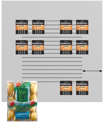
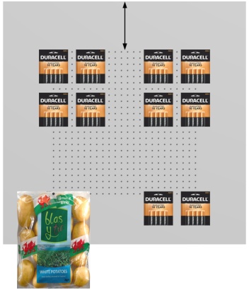
Bottom margin (Selected back panels)
The distance from the bottom edge of the back panel beyond which products cannot be placed.
- Supported values: positive/negative numeric value [+-0-9 and decimal point] (based on Measurement unit)
- Default value: 0
- Example: -6
Back panel type changes the effect of this margin:
- Solid: half of the product height is allowed to overflow the margin.
- Pegboard, Slatwall: the margin defines the lower limit of the area with peg holes or slats. Products can use all available peg holes or slat area. They can overhang below the back panel (as in the potato bag below).

Note: Negative values allow moving products and accessories completely below the back panel. (They must first be placed on the actual panel.)
Top margin (Selected back panels)
The distance from the bottom edge of the back panel beyond which products cannot be placed.
- Supported values: positive/negative numeric value [+-0-9 and decimal point] (based on Measurement unit)
- Default value: 0
- Example: -6
Back panel type changes the effect of this margin:
- Solid: half of the product height is allowed to overflow the margin.
- Pegboard, Slatwall: the margin defines the upper limit of the area with peg holes or slats. Products can use all available peg holes or slat area.

Note: Negative values allow moving products and accessories completely above the back panel. (They must first be placed on the actual panel.)