Tools and commands (Project item list)
There are many options to configure the list of items.
This is done from its toolbar, from its context menu, and directly from within the list.
Project item list: toolbar
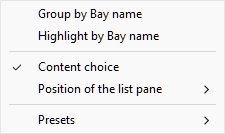
Project item list: context menu
Content choice (Project item list)
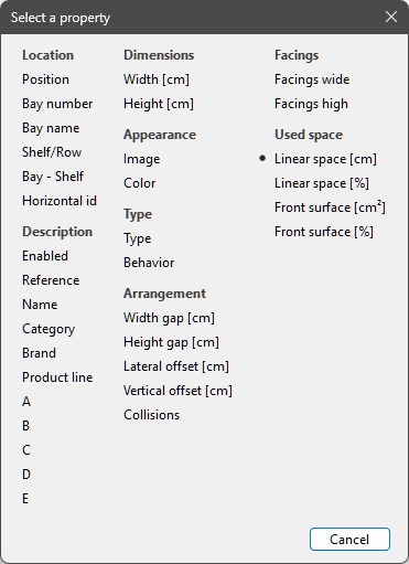
This button on the left of the list toolbar opens a dialog where you can choose what to display in the list.
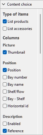
Instructions:
- Click on Content choice.
- The dialog is now displayed.
- Put a checkmark next to the information to display in the list. The various choices are explained below.
- Click OK.
Type of items (Project item list)
This section lets you choose which type(s) of items you want displayed in the list.
List products
Toggles the display of products in the list.
- Supported values:
- Checkmarked: products are displayed in the list.
- Not checkmarked: products are not displayed in the list.
- Default value: Checkmarked
List accessories
Toggles the display of accessories in the list.
- Supported values:
- Checkmarked: accessories are displayed in the list.
- Not checkmarked: accessories are not displayed in the list.
- Default value: Not checkmarked
Columns
For each property displayed in the list as a column, the value is shown for each product or accessory. Totals per group and per project are also shown when possible for numeric and percentage values.
All the available choices are in the form of checkboxes which toggles the display of the corresponding values in the list.
- Supported values:
- Checkmarked: the corresponding values are displayed in the list.
- Not checkmarked: the corresponding values are not displayed in the list.
- Default values: based on your last choices
Notes: If some columns don't fit in the list pane, you can use the horizontal scrollbar to view them.
The following groups of properties and metrics are available:
Picture
Thumbnail
A thumbnail image of each item in the list. Thumbnails can help identify each product visually in the listing.
Font height determines the thumbnail size.
Location
Calculated values indicating where each item is located in the planogram.
Location
A unique number from 1 to n for each product and accessory.
Warning:
The position is calculated only for the type(s) of items listed. For example, if you checkmark only products, accessories in your planogram will not be assigned a position number. In such cases, their position on labels or product tooltips will display a dash (-) instead of a number.
The numbering order is based on each item physical location with the following rules:
- On each bay, numbering is ordered from the product closest to the front-left of the highest shelf/row to product closest to the rear-right of the lowest shelf/row.
- If items are grouped in the list as follows, by Bay number or by Bay name, item numbering restarts from 1 at each bay (cf. Group).
- If items are not grouped or grouped by any other property in the list, a unique number is assigned to each item in the project. In this case numbering starts from items on Bay number 1 and ends with those on the last bay number in the planogram.
Advice: To facilitate identifying where each item of the list is placed in your planogram, you can combine displaying Positions (and/or any other item property by the way) in various places:
- As a column in Project item list. cf. Project item list (toggle) and Content choice (Project item list).
- As item labels in the visualization area and in Single pictures. cf. View labels and Content (Labels).
- As item labels in Report pictures. cf. and View toggles (Report pictures) and Content (Labels).
- As item tooltips in the visualization area. cf. Text of item tooltips.
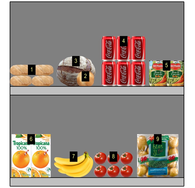
Example showing how Location is assigned to each product
Bay number
A unique number assigned to each bay. Numbering starts from the left-most bay and ends with the right-most bay in the planogram as seen from the front.
Bay name
The name of each bay (defined in Bay name). If no name is defined for a given bay, its name is displayed in the item list as: Bay [Bay number], for example Bay 7.
Shelf/Row
A number from 1 to n representing on which shelf or row each product is placed.
Notes:
- Numbering starts from the top and ends at the lowest row or shelf of each bay.
- Empty shelves are also numbered.
Bay - Shelf
This provides a more compact version of item position, combining Bay number + Shelf/Row. For example, 2 - 5 means the item is on Bay 1, shelf 5.
Horizontal id
A number from 1 to n representing the order of each distinct item from the rear left to the front right on each shelf / row.
Note: Blocks of multiple same products account for a single horizontal ID.
Description
Properties describing the items (as defined in Database and/or in Item Info).
[Item classification properties - Level 1]
[Item classification properties - Level 2]
[Item classification properties - Level 3]
Item custom properties [1 - 20]
cf. the above links for details.
Dimensions
The dimensions of items (as defined in Database).
cf. the above links for details.
Appearance
Properties defining the appearance of items (as defined in Database).
cf. the above link for details.
Type (Project item list)
Properties defining the type items (as defined in Database and/or in Item Info).
Type
The type of item, either Product or Accessory, based on the type defined for each item. in the database. cf. Type (Item properties) for a description of these types of items.
Behavior
cf. Behavior (Products) and Behavior (Accessories) for details.
Arrangement
Properties defining the physical arrangement of items on shelf or hooks (as defined in Database and/or in Item Info).
Lateral offset (Item properties)
cf. the above links for details.
Facings
Values indicating the quantities for each item in the planogram.
The totals are computed per block of same products, according to the following rules:
- Adjacent same products part of a same product block (single selectable entity) are grouped on one line with the total quantity for the block.
- Adjacent same products part of separate blocks (multiple entities) are shown on separate lines in the list with the totals per line.
- Different products stacked vertically are not accounted on the same block. They are listed on distinct lines.
cf. the above links for details.
Facings front
|
|
|
|
= |
Facings front |
Used space
Calculated values showing the space used by products in your project.
Note: the following values are computed based on the space taken by each product block including the gaps between products if any. For example, a product measuring 10 cm wide × 8 cm high placed twice in width and twice in height, with a gap of 1 cm in width results in this front surface:
((10 cm × 2 + 1 cm) × (8 cm × 2)) = 336 cm2
Linear space [Measurement unit]
The width used by each block of same products on the shelving.
Values are expressed in your preferred measurement unit (cf. Measurement unit).
- For products on shelf: the width of each block of products. (Each row uses the same shelf, so we count only the base row of the stack as using linear space.)
|
|
|
|
+ |
Width gap × (Facings wide -1) |
|
= |
Linear space [Measurement unit] |
- For pegged products: the width of each block of products × the quantity of products in height. (Each row uses a separate hole on the back panel, so we count each row as using linear space)
|
|
|
|
+ |
Width gap × (Facings wide -1) |
|
= |
Sub-total |
|
× |
|
|
= |
Linear space [Measurement unit] |
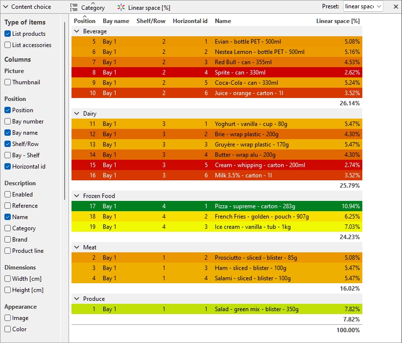
Linear space [%]
The width used by each block of same products, expressed in percentage of the total space used by products in the project.
- For products on shelf: the width of each block of products.
- For pegged products: the width of each block of products × the quantity of products in height.
|
|
Linear space [Measurement unit] (current block of products) |
|
/ |
Linear space [Measurement unit] (current project) |
|
= |
Linear space [%] |
Front surface [Measurement unit2]
The front area (width × height) used by each block of products.
Values are expressed in your preferred measurement unit (cf. Measurement unit).
|
|
|
|
+ |
Height gap (effective gap) × (Facings high -1) |
|
= |
Sub-total |
|
× |
|
|
= |
Front surface [Measurement unit2] |
Front surface [%]
The front area (width × height) used by each block of products, expressed in percentage of the total area used by all products in the project.
|
|
Front surface [Measurement unit2] (current block of products) |
|
/ |
Front surface [Measurement unit2] (current project) |
|
= |
Front surface [%] |
Group
You can group items in the list by any available item property.
When using groups, sub-totals per group are also displayed for applicable columns (percentages and numeric values).
Group (toggle)
To toggle grouping of the items in list, there are two methods:
Button:
- Click on the button named Group above
the item list:

- When the button is pressed, your items are grouped in the list.
- When the button is not pressed, your items are not grouped n the list.
Context menu:
- Right-click anywhere within the list pane to show its context menu.
- Click on Group in the menu to toggle
grouping:
- When the menu text is black, your items are grouped in the list.
- When the text is grayed out, your items are not grouped in the list.
Notes:
- The current grouping status is kept until the current user changes it.
- with Presets, the chosen grouping status can be saved and reloaded.
Group by…
To select by which property the items are grouped in the list:
- Activate Group.
- Then, use one of the two available methods:
- Button: click on the text on the right
of the button () above the item list.
- Context menu: right-click on the list to show its context menu, then click on Group by… in the menu.
- Button: click on the text on the right
of the button (
- A dialog appears with the list of available properties to group items.
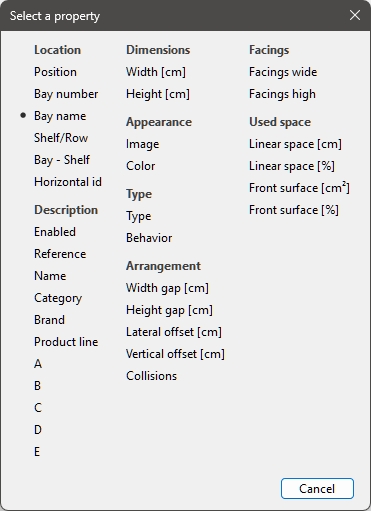
- Click on the property your items should be grouped by, ex: Bay name.
- The list of items is now grouped, as
indicated by the text on the right of the button ().
Notes:
- The current grouping property is normally kept until the current user changes it.
- If the chosen grouping property is not available, Bay number is used for grouping.
- Presets can save and reload the chosen grouping property.
- If you group by the following properties: Bay name, Bay number, Location re-starts at 1 for each group.
Examples:
- The screenshot in Project item list shows the list grouped by Bay name.
- The screenshot in Highlight by… Category shows the list grouped by Category.
Group sort order
To toggle the sorting direction of the groups in the list:
- Activate Group.
- Click on the small arrow on the right of the
grouping icon and property above the item list.
- When the arrow points up, the groups are sorted in alphanumeric order from lowest to highest value.
- When the arrow points down, the groups are sorted in alphanumeric order from highest to lowest value.
Expand all groups / Collapse all groups
To expand / collapse all groups in the list:
- Right-click anywhere within the list pane to show its context menu.
- Click on respectively Expand all groups / Collapse all groups.
Highlight
You can highlight items in Project item list and Visualization area by any available item property and several calculated values, for example space usage per product in your project.
Highlights are applied onto items in the following way:
- For textual values (ex: Highlight by… Category):
- A distinct color is applied to each distinct value. This gives a visual indicator of which value items have.
- For Boolean values (ex: Highlight by… Enabled):
- A red color is applied to items which values for the selected property are not checkmarked (No).
- A green color is applied to items which values for the selected property are checkmarked (Yes).
- For numeric and percentage values (ex: Highlight by… Linear space [%]):
- A color from a range between red and green is allocated to each item based on its value relative to the minimum and maximum item values found in your planogram. In this case, the applied colored range also appears at the top of the visualization area as a colored horizontal bar with sample values as a legend. Highlighting items per measurable properties or calculated values gives you a visual performance indicator.
Highlight (toggle)
To toggle highlighting of the items (Project item list and Visualization area), there are two methods:
Button:
- Click on the button named Highlight
above the item list:

- When the button is pressed, your items are highlighted.
- When the button is not pressed, your items are not highlighted.
Context menu:
- Right-click anywhere within the list pane to show its context menu.
- Click on Highlight in the menu to
toggle grouping:
- When the menu text is black, your items are highlighted.
- When the text is grayed out, your items are not highlighted.
Notes:
- The current highlighting status is kept until the current user changes it.
- The highlighting status can be saved and reloaded with Presets.
Highlight by…
To select by which property the items are highlighted (Project item list and Visualization area):
- Activate Highlight.
- Then, use one of the two available methods:
- Button: click on the text on the right
of the button () above the item list.
- Context menu: right-click on the list to show its context menu, then click on Highlight by… in the menu.
- Button: click on the text on the right
of the button (
- A dialog appears with the list of available properties to highlight items.
- Click on the property your items should be highlighted by, (for example Linear space [Measurement unit]).
- The items are now highlighted, as indicated
by the text on the right of the button ().
Notes:
- The current highlighting property is normally kept until the current user changes it.
- If the chosen highlighting property is not available, Linear space [Measurement unit] is used for highlighting.
- Presets can be used to save and reload the chosen highlighting property.
Examples:
Highlight by… Category
Items are highlighted with colors based on their value for the following property: Category.
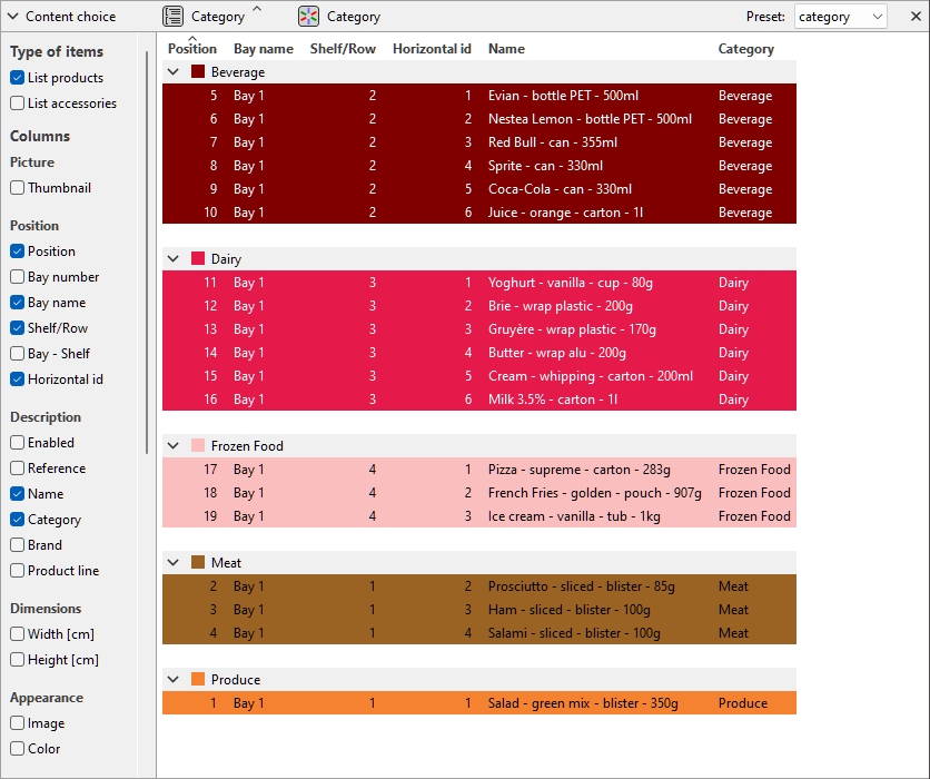
Products highlighted by Category in Project item list
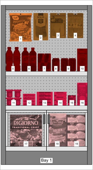
Products highlighted by Category in Visualization area
Highlight by… Enabled
Items are highlighted in red or in green to indicate if each item is enabled or disabled (the value of Enabled in your database).
Explanation: products and accessories can be disabled in the database, so they aren’t displayed in the catalog. However, if you open a project which contains disabled items, these are loaded and display on your bays because they still exist in the database.
Highlighting these items in red helps you quickly identify them in your current project.
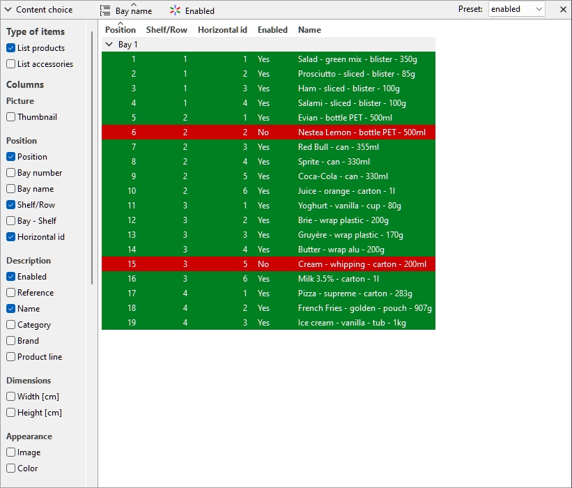
Products highlighted by Enabled in Project item list
Products highlighted by Enabled in Visualization area
Note: If you disable items in the database while they are in the currently opened project, the disabled items will only be highlighted after reloading the project.
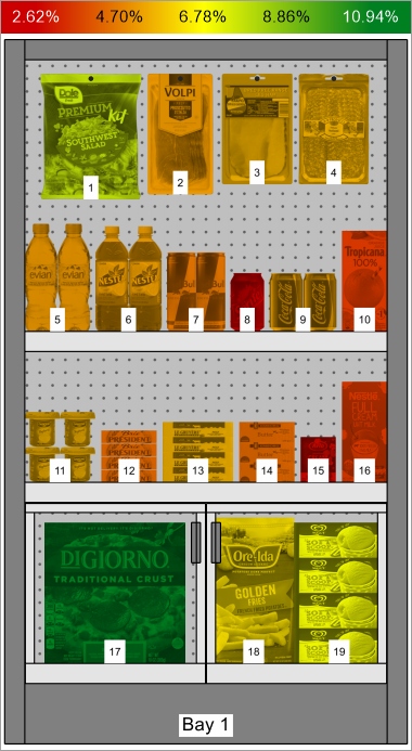
Highlight by… Linear space [%]
Items are highlighted from red to green based on the width percentage each represents in the opened planogram (Linear space [%]).
The color range helps you quickly visualize the space used by each product.
Products highlighted by Linear space [%] in Project item list
Products highlighted by Linear space [%] in Visualization area
Item sort order
To sort the items in the list according to the desired column content:
- Click on the desired column header in the list of items (for example Location).
- Click again to invert the sort order.
To sort the list groups (if any) in the desired order:
- Click on the group header next to the group icon (for example Bay number).
- Click again to invert the sort order.
Column order
To re-arrange the order of columns in the list:
- drag any column header left or right to the desired position.
Presets (Project item list)
This feature lets you save and apply multiple preferred parameters for the list. This is very useful to quickly switch between various types of lists to display on screen or to include in reports.
The following parameters of the list are stored in each preset:
Preset (Project item list)
A drop-down list where you can select a saved preset. If a saved preset is currently used, its name is displayed.
The list of presets saves parameters per user. The presets saved here are available to you with any planogram project.
Create a preset (Project item list)
To save the current list configuration as a preset:
- Right-click anywhere within the list pane to show its context menu.
- Move your mouse cursor over Presets in the menu.
- Click on Save as.
- In the list toolbar, next to Preset, type the desired name for the current list configuration.
- Click on Save.
- The current list configuration is now saved and available for re-use.
Apply a preset (Project item list)
To apply a previously saved preset:
- In the list toolbar, next to Preset, click on the preset list to expand it.
- Select the desired preset to apply it.
Delete a preset (Project item list)
To delete a previously saved preset:
- In the list toolbar, next to Preset, click on the preset list to expand it.
- Select the preset you want to delete.
- Right-click anywhere within the project item list.
- A context menu is displayed.
- Move your mouse cursor over Presets in the menu.
- Click on Delete to delete the current preset.
Layout of the pane of the list
You can move and resize the entire pane of the list.
Position of the list pane
To move the pane to a different location on screen:
- Right-click anywhere within the Project Item List panel to show its context menu.
- Move your mouse cursor on Position
- Click on Left, Right, Top or Bottom.
- The Project Item List is now placed in the selected location.
Size of the pane of the list
To resize the pane on the screen:
- Place the mouse cursor on the separation line between the list pane and the visualization area. The cursor turns into a double-ended arrow.
- Drag the separation line to the desired location on screen.
- The pane is now resized.
Note: if some columns don't fit in the list pane, you can use the horizontal scrollbar to view them.